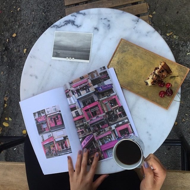
Seoul-based PECAN is a magazine about travelling and finding the inner voice of a city. Founded by Jaimie Stettin and Hanah Chung, each issue becomes a guidebook to the heart of a city.
Can you tell us about you and your magazine?
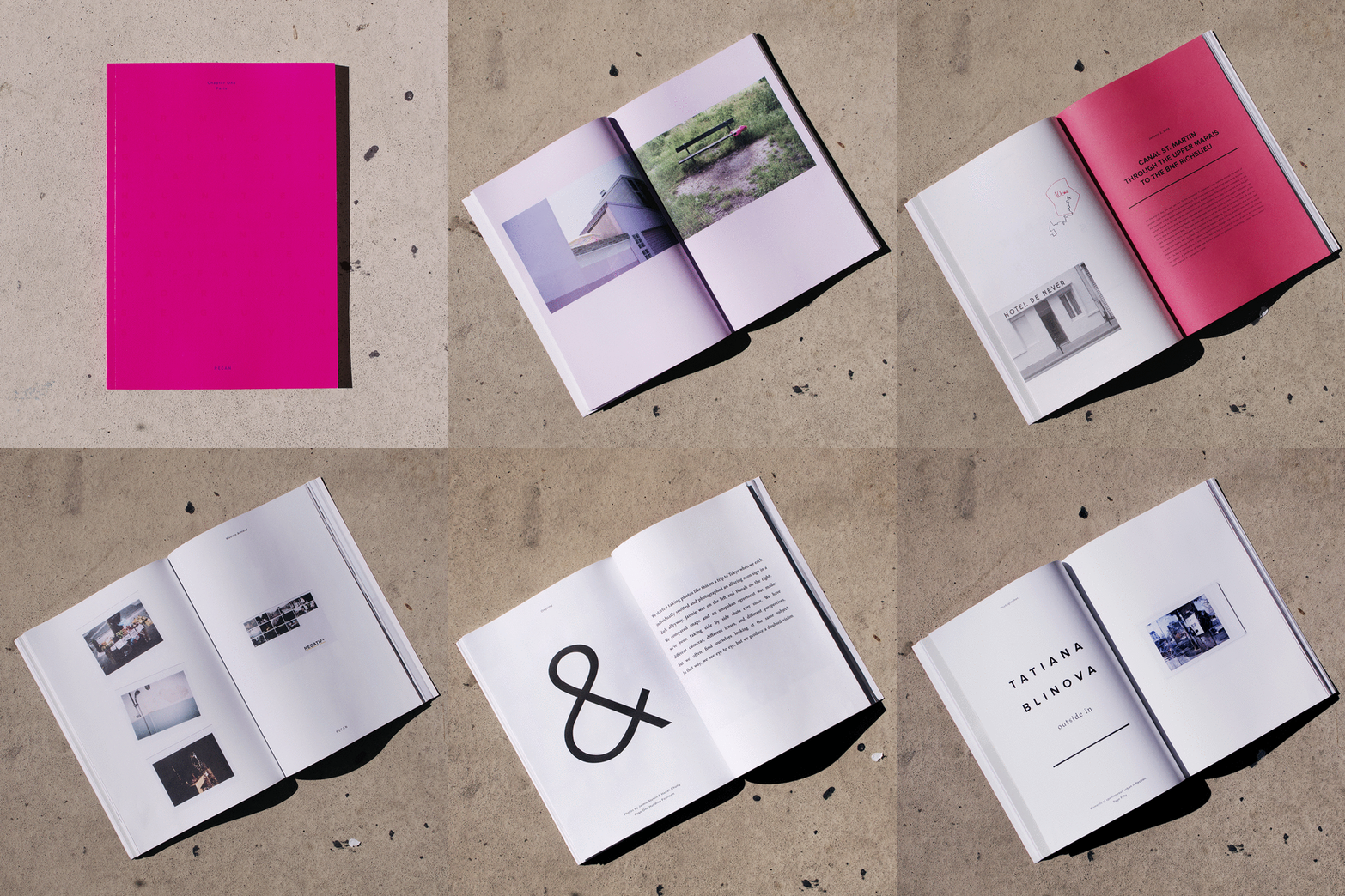
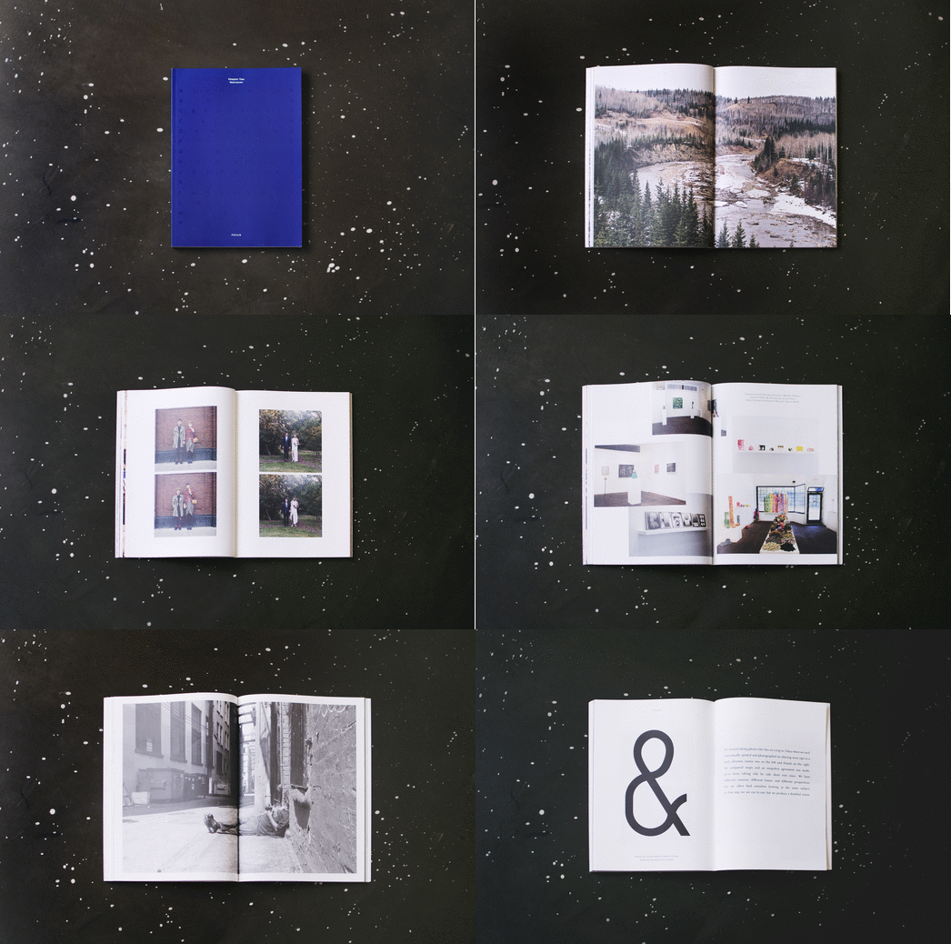
We describe PECAN as a series of lyrical guidebooks to cities around the world. We print three issues per year, each one based in a different city, and each one a collection of creative work made by people who live in that city. Each city is represented with a different color cover and content that is wholly unique to its destination. Flipping through each issue is like having a group of friends show you around.
The journey for this mag starts with a friendship (between me, Jaimie, and designer Hanah Chung). We met while teaching English in South Korea and began a friendship and creative partnership that led to a single issue publication called L VE M TEL (http://lvemtel.tumblr.com/), and then to PECAN, our current collaboration. We travel when we can (together in the past, and now separately), and while we no longer live on the same continent, in many ways, PECAN is a celebration of our cities, our travels, our tendencies to reach out to and become part of creative communities around the world.

And editorial-wise, what is it like?
We’re open about content. We love photography, illustration, design. And while the aesthetic of the magazine itself is clean and sleek, the content can be wilder, more vibrant. It really depends on who we meet or know or connect to in a certain city. We seek out feelings, emotions, and textures for each issue, but they are not necessarily predetermined.
I asked our designer Hanah Chung to comment on this, too, and she said, “We are often asked if each issue presents a certain theme or story, and my answer is always no. We never set out with the intention of tying all the spreads together with a singular theme. We carefully gather what we like and it all comes together.”

Why choose print? What kind of paper do you use and why? What about your typography choices?
Print is tactile, slow, enduring. It may not be the cheapest or most practical medium, but it has a weight and a presence. When you flip through a magazine, you can take time, you can linger.
In Hanah’s words: “Images you see online can be rich in colour and beautiful to look at, but oftentimes quite fleeting, with just a few seconds of screen-time. On print, seeing these same images can become a totally new experience. The select few that are chosen for print become artifacts on paper that you can return to in a much more real way.”
We use a pretty light, uncoated paper (100gsm). For type, we mix a bold sans serif and a more classic serif on our title pages, and tend to go with a slimmer sans for body text, although we mix that up too. We only use two font families through the entire series.
How’s the public response?
We generally get positive feedback regarding the magazine. People think the covers are cool and that the content is captivating. Readers comment about loving the scent and texture of the paper we use, and about lingering on different pages or spreads. They’re always surprised to hear that we are a team of two. Overall, the magazine seems to be a crowd pleaser.
Good print mags get a lot of love that doesn’t always translate to sales or advertising. How are the sales? Advertising-wise, do you have a traditional approach of selling an ad page or more of a brand ad approach?
As most people know, the print business is pretty tough these days. That said, our print runs are modest and our sales goals are in line with that. We are not a mass-distributed publication and that’s not our intention. We handle all distribution ourselves and have personal contact with most of our stockists. We’re not trying to be in everyone’s hands, just those that want to hold our mag.
Our first two issues (Paris and Vancouver) were fully funded, and for our third (Seoul), we’re funding it with sales revenue from the first two issues. We’ve never had any plans for traditional advertising on our pages.
Upcoming projects
We’ve printed the third issue (the Seoul issue) this fall, and we were at Unlimited Edition 7 (the Seoul equivalent to the NY Art Book Fair). As for next cities and issues, that’s still under wraps, but we’ve got some ideas in the works.


