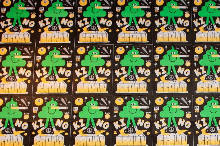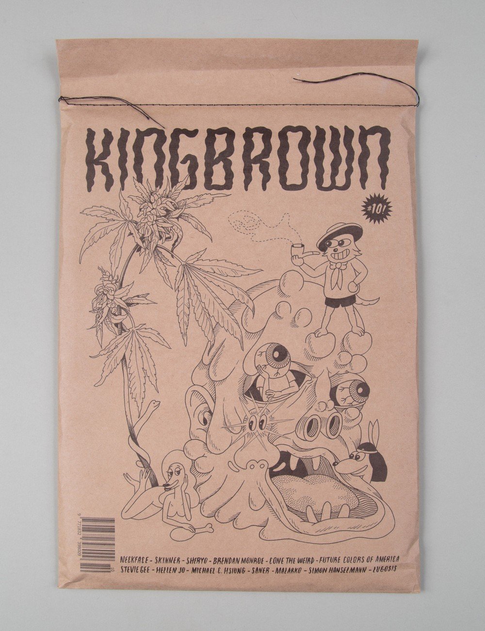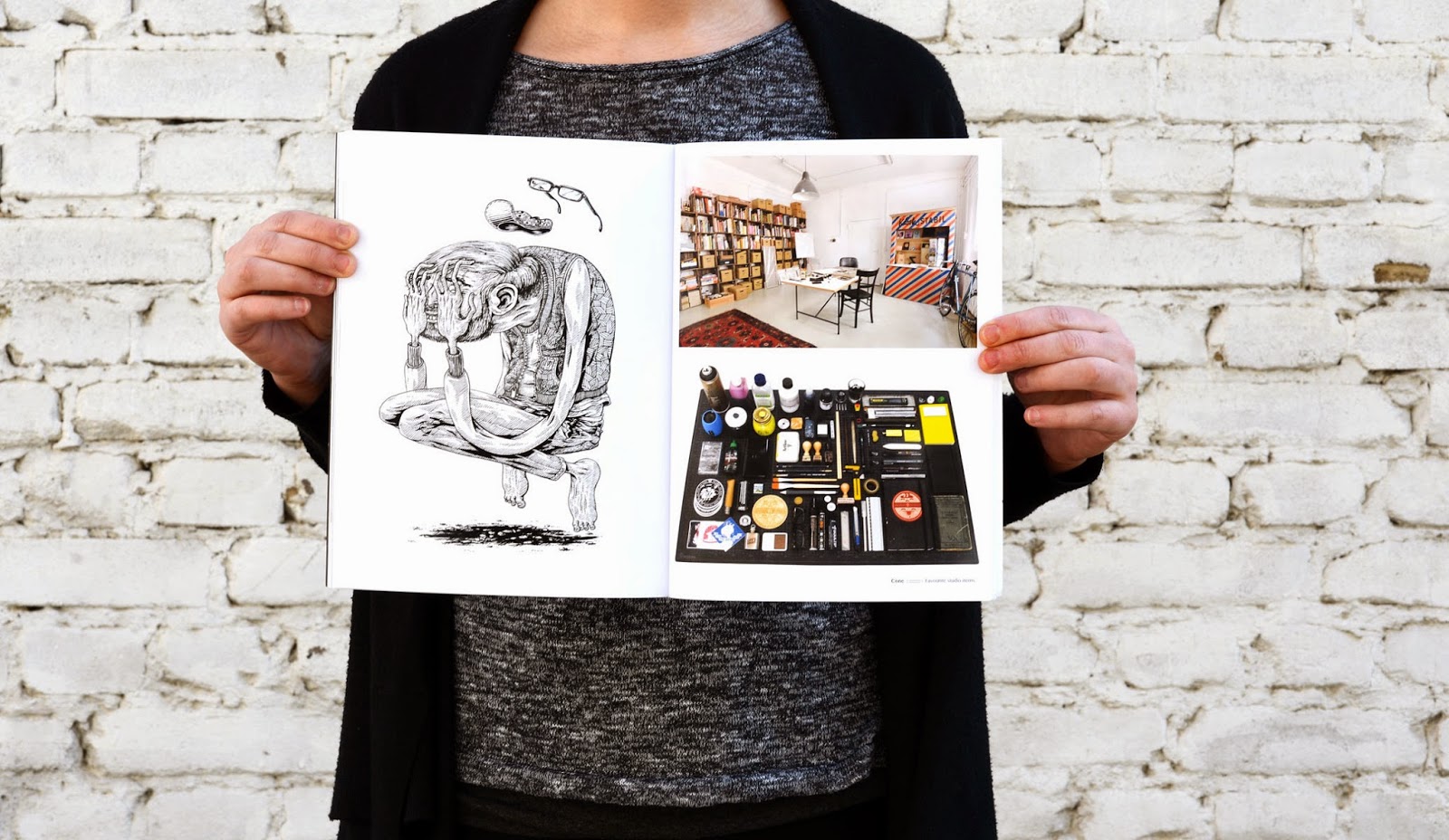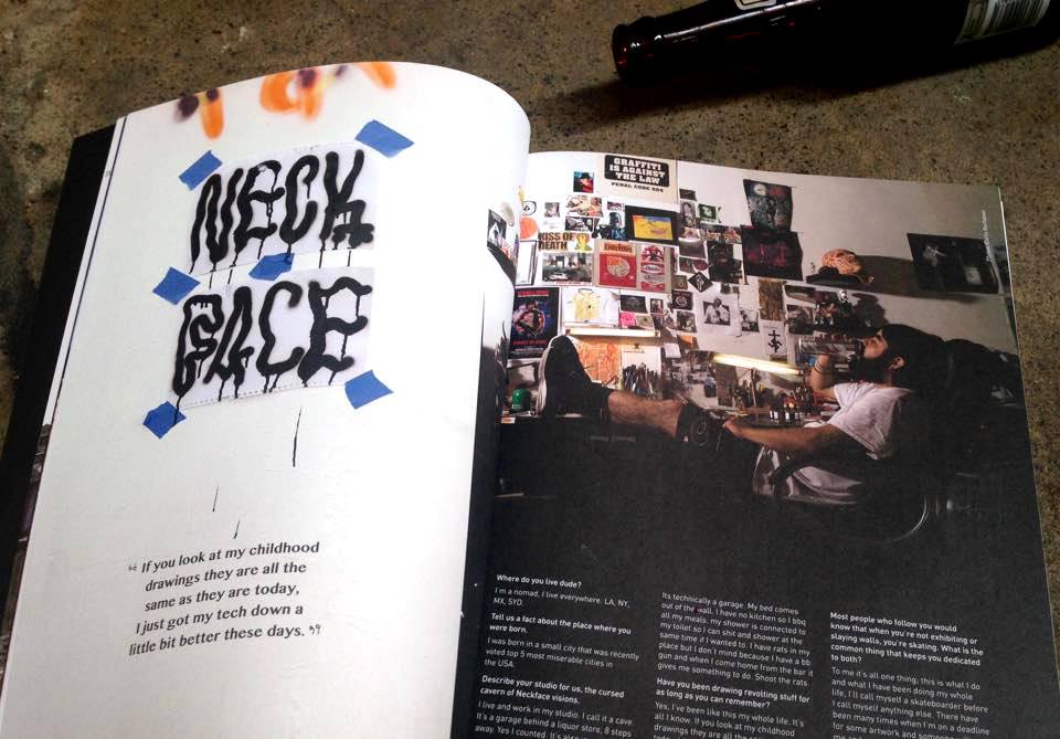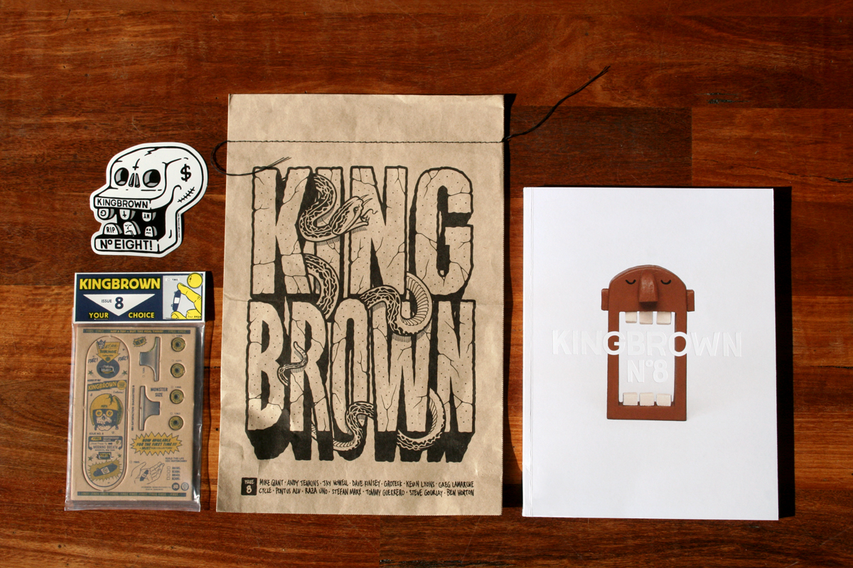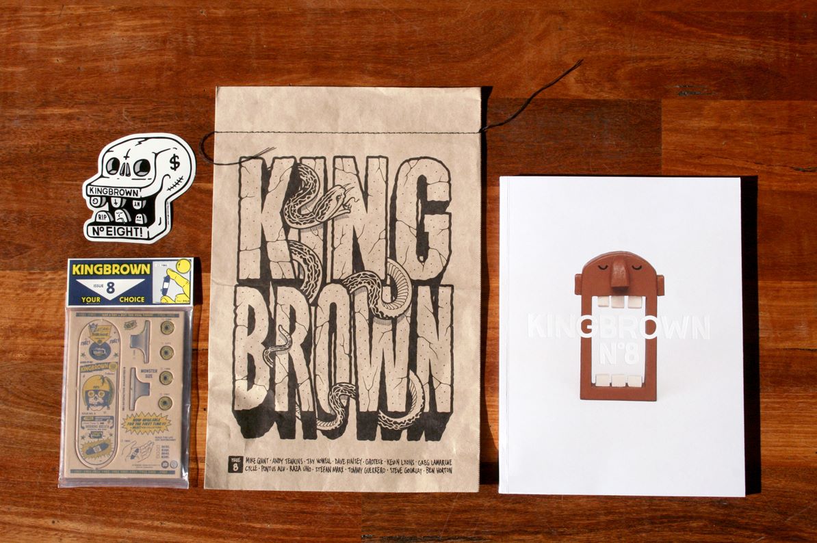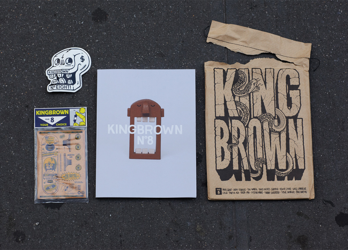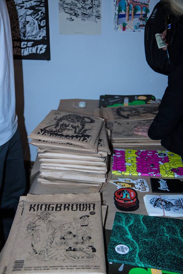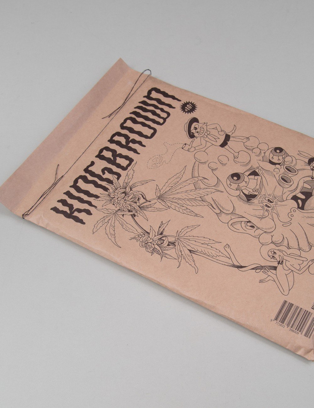
From West Australia comes KingBrown , a contemporary art magazine bringing together an amazing lineup of artists. Every issue is wrapped inside a brown bag and holds large volume of art to feed you for months. Interview with Ian Mutch, the editor-in-chief.

Can you tell us about your magazine?
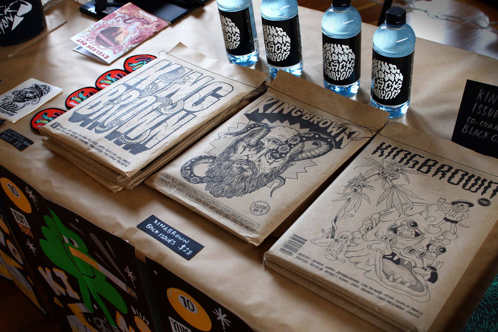
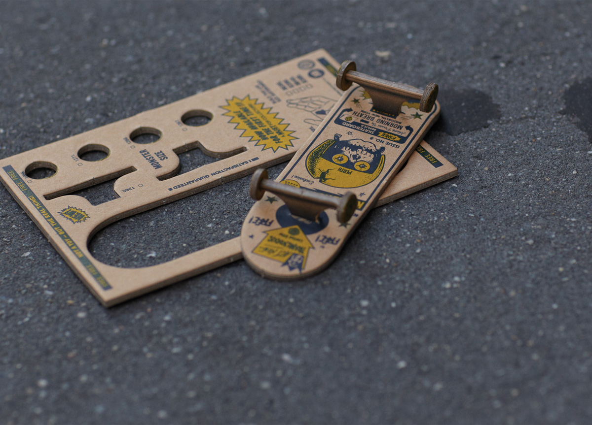
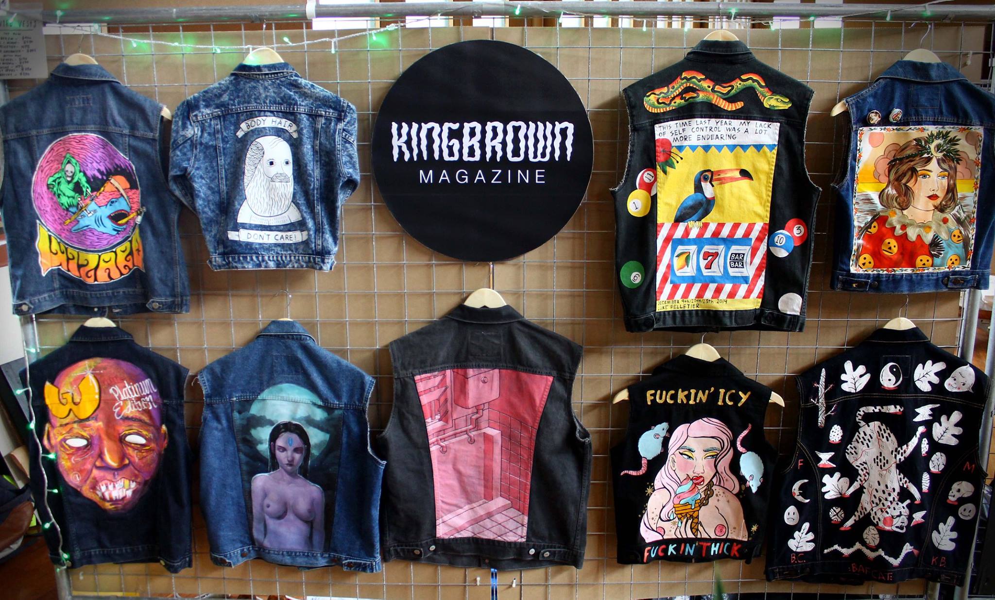
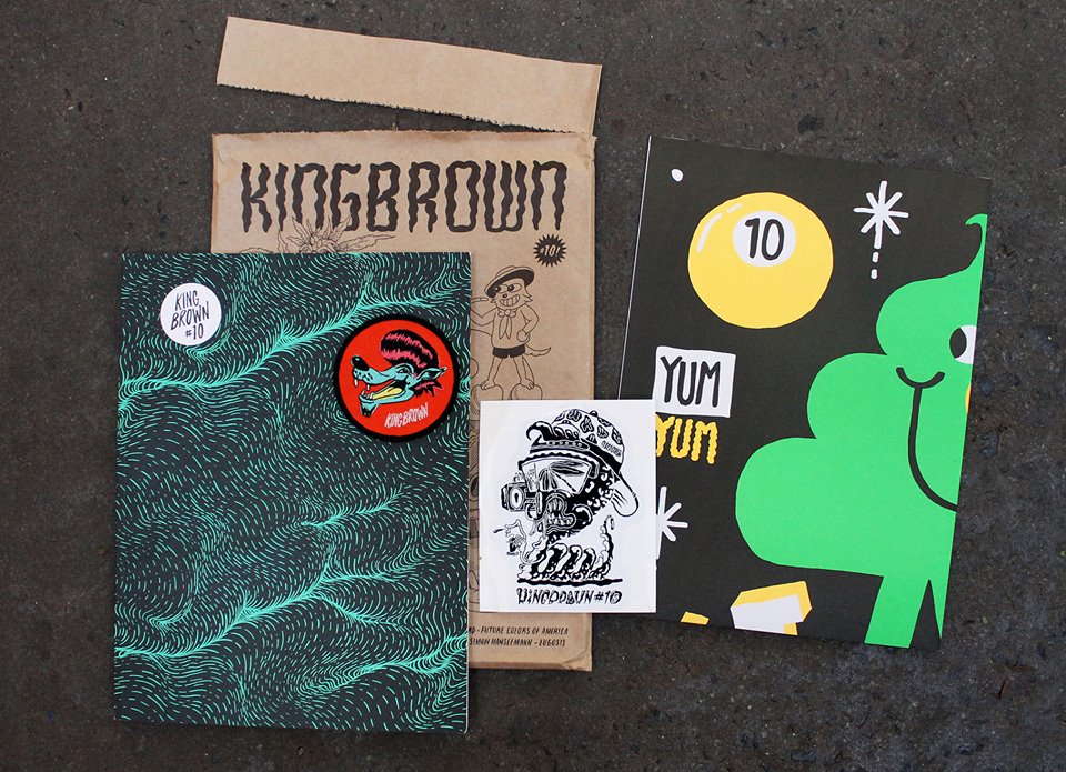
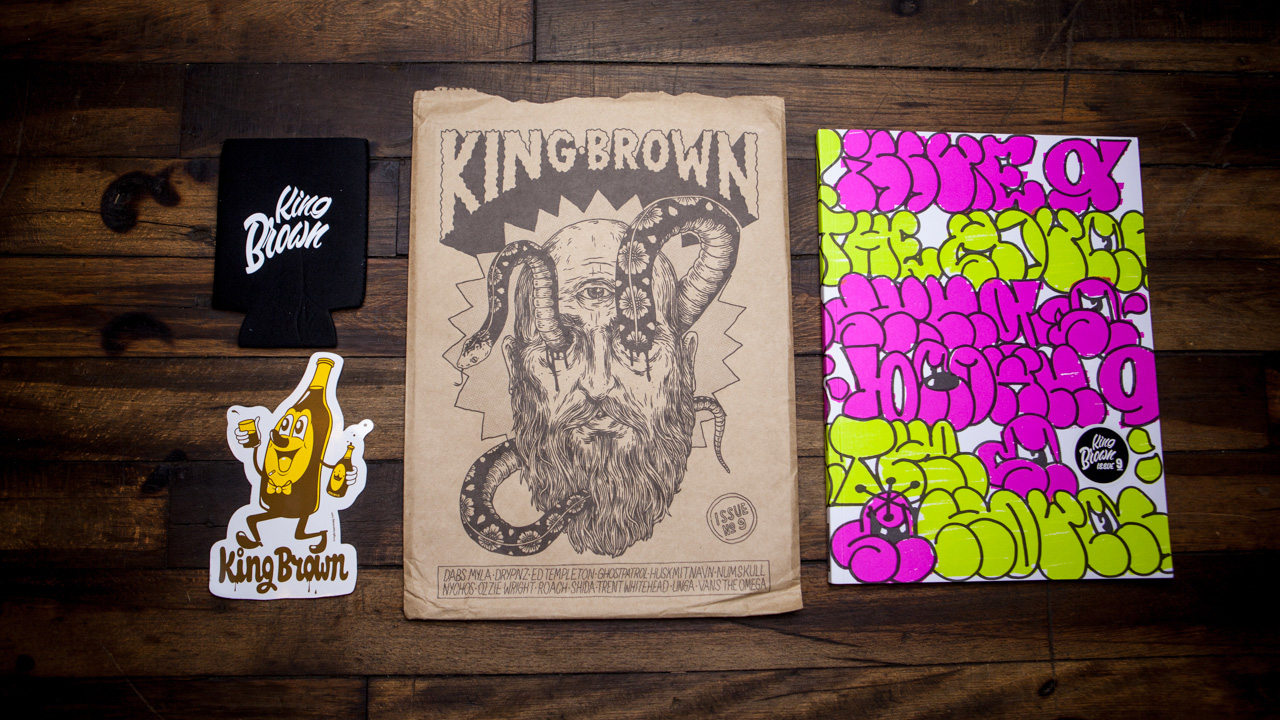
Inside Kingbrown you will find profiles and interviews that take you on a journey inside the studios and minds of internationally renowned contemporary artists. Printed with quality in mind, each edition is a collectable item, sealed and packaged in a brown bag with cool inserts. That’s pretty much the blurb from our website. It all really started when my friend Yok and I went to University together and one night at a house party we talked about how it would be cool to start a magazine. Then we got drunk. A couple of days later we made the time to chat about it more seriously – like the format, style, title, and how we would source funding. We didn’t know much about publishing back then, but we were educated in design, advertising and print. We felt Kingbrown was needed to represent a mix of quality Australian artists alongside the big-name internationals. We’ve learnt plenty of things along the way like brewing beer, holding big launch parties and traveling tax breaks.

And editorial wise?
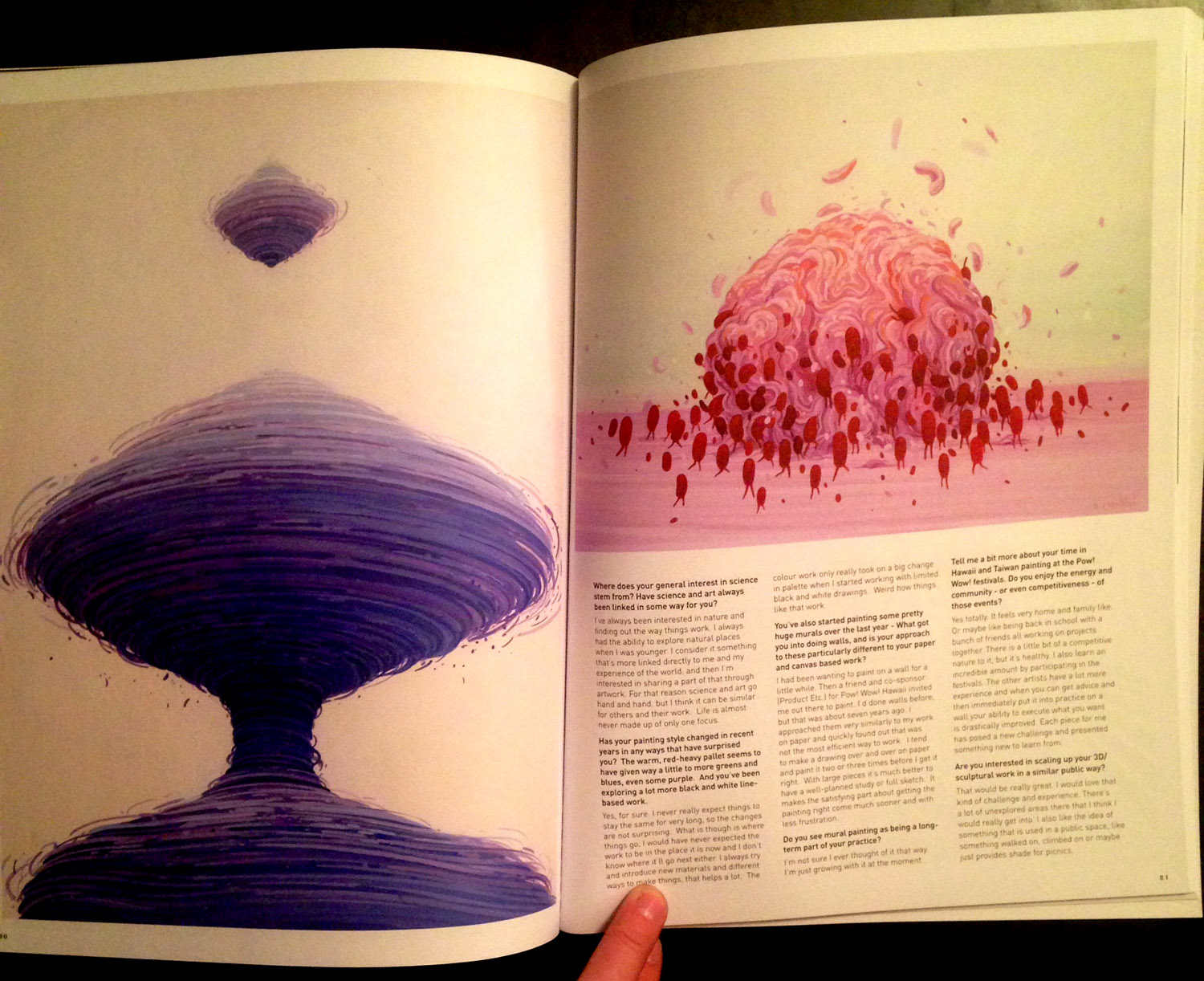
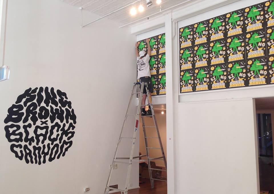
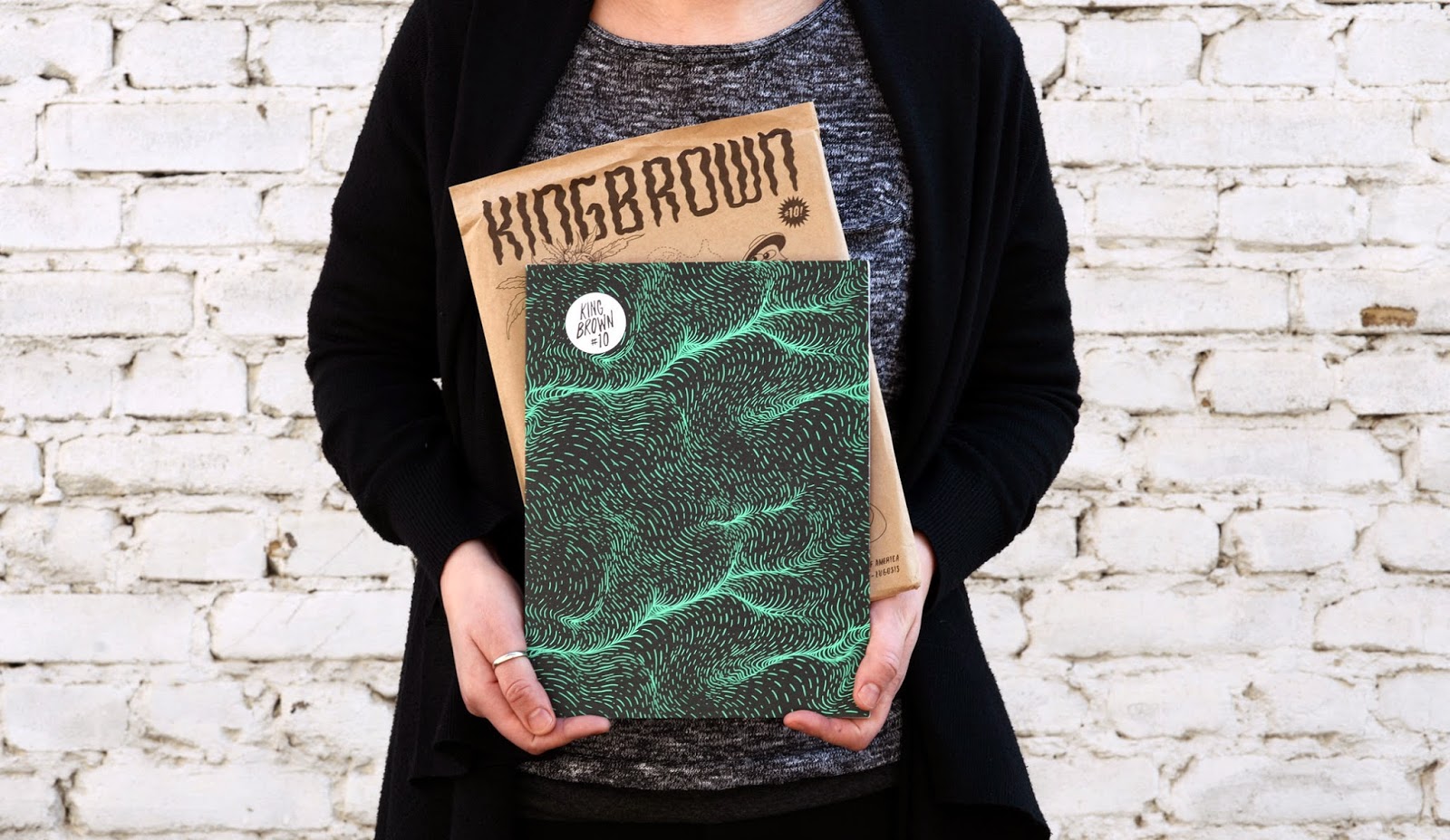
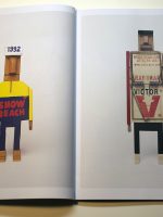
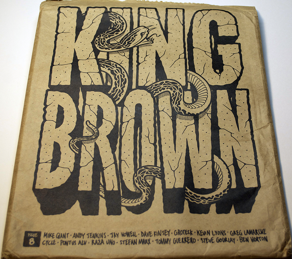
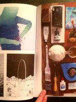
Kingbrown is West Australian slang for a longneck beer – a 40 oz. Wrapped in a brown bag, just like a good 40 should. Our magazine follows this style. It is freshly wrapped inside a brown bag and holds large volume. There is little to no advertising. The pages are printed with tasty artwork from quality artists. Recently we’ve enjoyed co-curating issues with our friends and peers. This opens up a wider range of artist networks and delivers more personal interview styles. Each edition has bit of a theme or style with the artists involved. Our content is mainly street related art, illustration, photography, music and skateboarding.

Our mission has always been to not take things too seriously. We like to always have fun with making the magazine plus enjoy the travel and the exhibitions… And strive to keep print alive for a bit longer, haha!

Why choose print? What kind of paper do you use and why? What about typography?
I grew up reading comics, books and magazines. Yok and I have always respected and loved publications such as Refill, Arkitip and Monster Children. Print is something we’re passionate about, holding the real thing in your hands, giving your eyes a break from pixels and screens. At Kingbrown we get to experiment with different stocks and print techniques, especially on the cover. New embellishments and insert ideas keep things fresh for us and the readers. When it comes to typography we use uniformed body and subhead styles, contrasted by interesting hand-drawn titles.

How’s the public response?
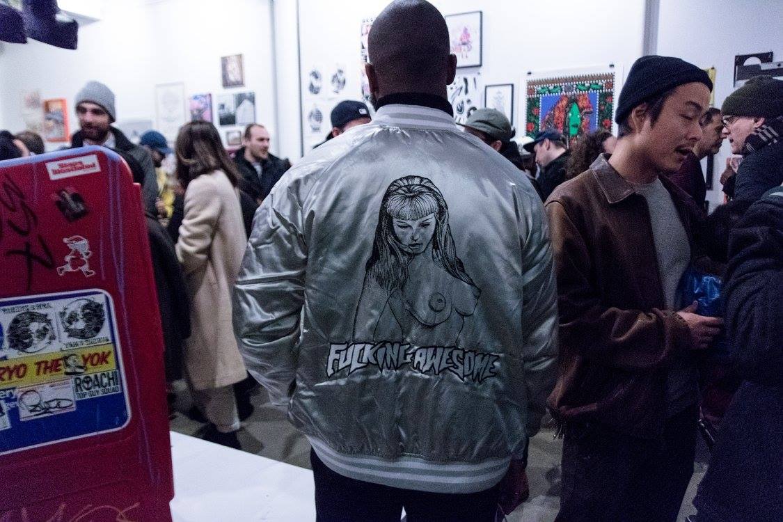
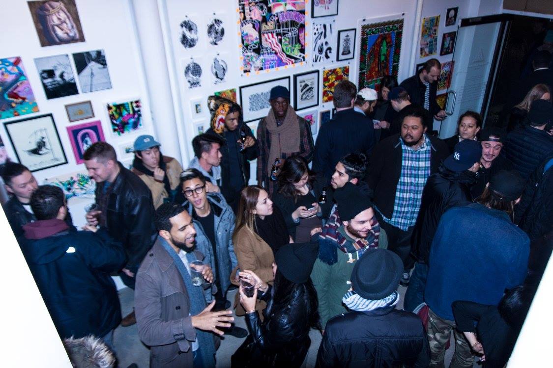
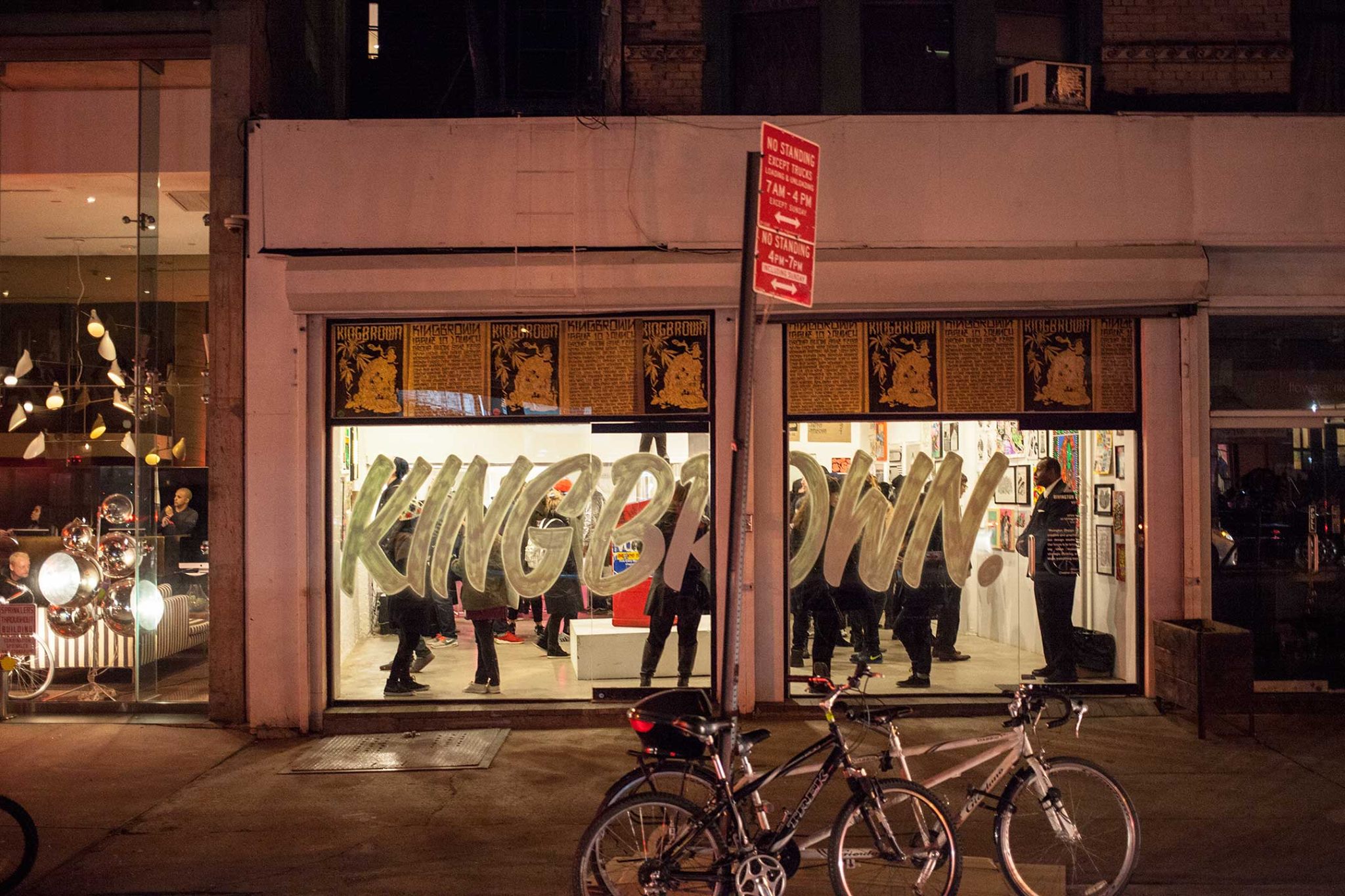
Kingbrown has a solid base of passionate followers. We’re limited edition and not a large circulation. I think readers seek us out because they know past issues sell out. We always have a rad time at our launch exhibition parties where we get to meet a lot of readers. The response is great. It’s rewarding to see the positive vibes at Kingbrown shows across different countries. If you’re in Canada hit us up direct for international postage rates via our web shop. We also offer domestic postage within the USA.

Good print mags get a lot of love that doesn’t always translate to sales or advertising. How are the sales? Advertising wise, do you have a traditionnal approach of selling an ad page or more of a brand ad approach?
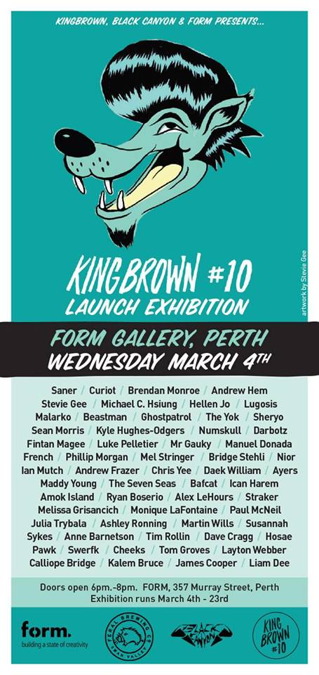
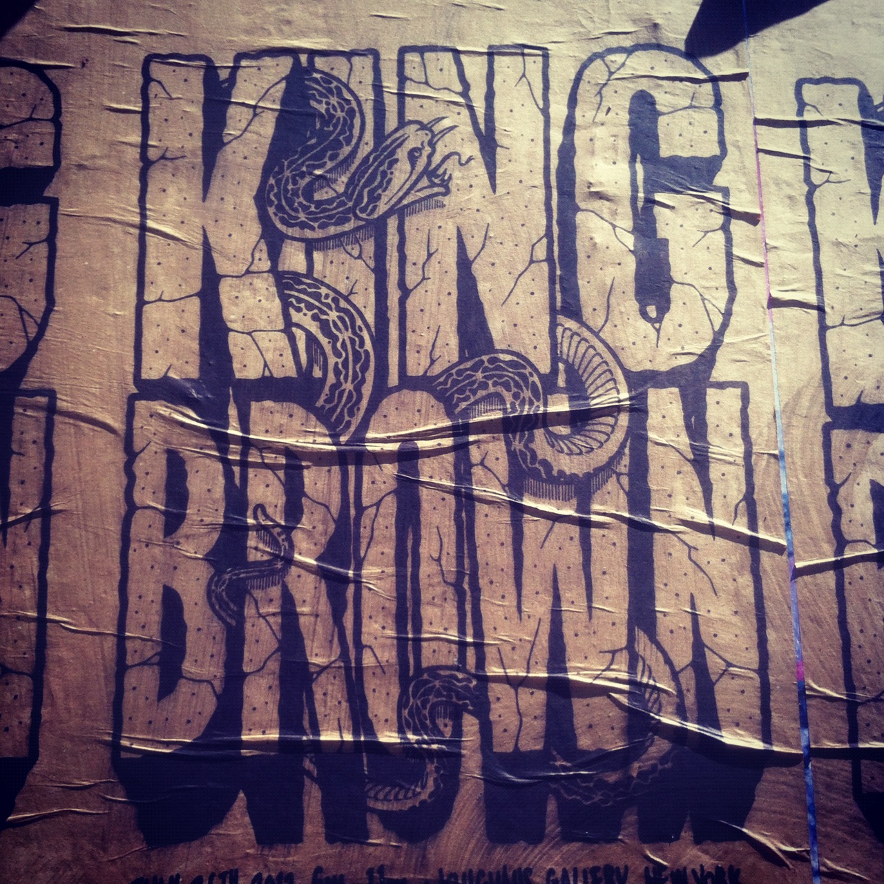
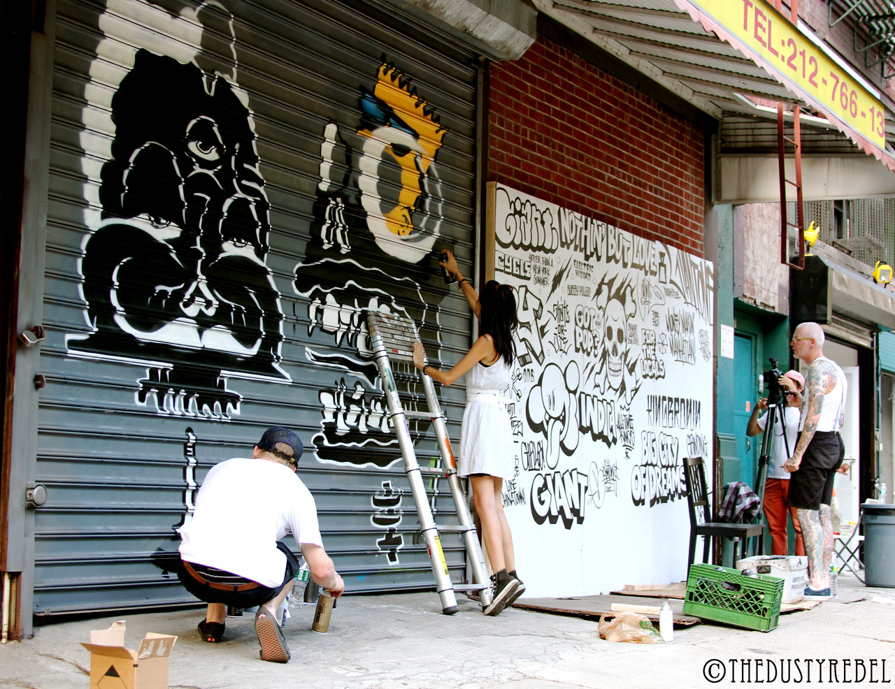
We don’t seek advertising and chase dollars but are definitely keen to hear from brands that wish to do something different, to discuss innovative ways to promote their message. We like to include print ads that are not hard-sell, even sometimes being associated with a particular featured artist works well. Advertising is not just limited to the printed page – we’ve done some cool stuff in the past, like create a punk zine insert for a paint brand, and some drink coaster inserts for a beer company. We also partnered with sneaker company Converse in NYC, constructing a giant shoe shaped ramp for a skate competition at the issue 8 launch exhibition.
kingbrownmag.com // ianmutch.com // facebook.com/kingbrownma // kingbrownmag.myshopify.com // instagram.com/kingbrown // kingbrownmag Vimeo

