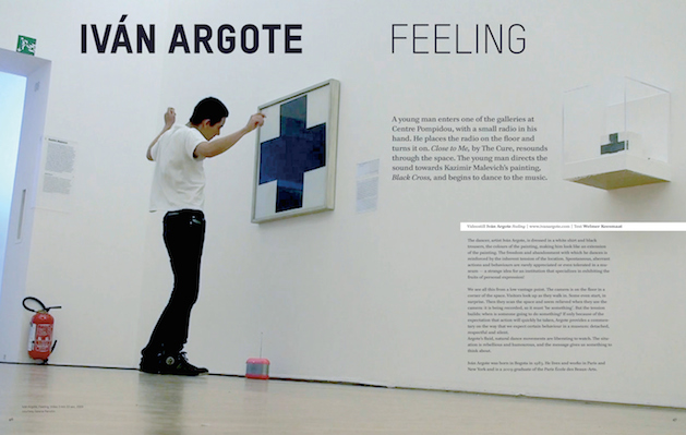
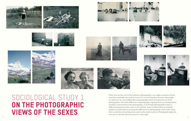
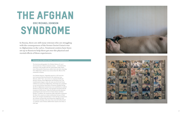
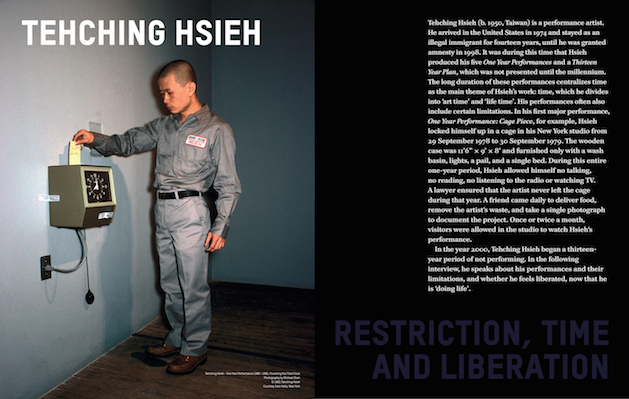
Published by Leonardo Calcagno

Yvi Magazine is an art magazine, written in English and published in The Netherlands. Each issue focuses on a central social theme seen from the art’s perspective. This whole artistic interpretation of social issues is expressed through photography, design, architecture and visual arts. Interview with editor Welmer Keesmaat.
Baron: Let’s start with a brief version of Yvi’s story…
Welmer Keesmaat:Yvi Magazine started as a graduation project when I was studying graphic design. I always wanted to do something that would combine my interests for graphic design and photography. It was quite a journey: the first issue of Yvi Magazine was also the first magazine I ever made AND designed, so I had to figure everything out for myself. The whole editing process felt quite natural to me; it was great to see how the idea suddenly came to life. Since it was my graduation project, I had to rush the whole thing up in order to finish it in time. All in all, I only had 4 months to create the magazine.
The reactions were very positive and I quickly sold over 200 issues without any proper distribution. With such good comebacks and since I had really enjoyed making a magazine, I decided to go on with Yvi.
The second issue, based around “consumption”, was distributed internationally, with a print run of 2500. The print run has grown to around 4000 at this moment.

B.: What is your editorial policy?
W. K.: Every issue of Yvi revolves around a central theme. I try to find as many different subjects inherent to each theme and then look for artists that have done something, or would like to do something, on that same theme. These topics are inspired by my own life and experiences; they are subjects that I’m personally researching or struggling with at the moment. This isn’t actually discussed in the magazine, so it stays objective, but it tells a lot about me at that moment.
The magazine has also changed over the years because of my own changing interests; there used to be more documentary photography early on, while, in the last issues, there is more space for fine art and video.
B.: Why choose print? What kind of paper do you use and why? Typography?
W. K.: First of all, I am a print lover. I want to hold something in my hands, feel the paper and smell the ink. It’s a totally different experience than looking at photographs or artworks online. Personally, I realize my focus lasts longer when I read printed publications. Yvi uses different kinds of paper, coated and uncoated. Because there are no advertisements in the magazine, it’s also a way to secure a certain rhythm and “headspace” in the magazine, elements that make the whole breathe a lot better.
The images and artworks are the leading visual force in our pages; the graphic design is there to help the images tell the story. The design is clean, using two fonts; a serif for the text and sans-serif for the headlines, captions and subtexts. I have changed the headline font twice, but it’s still really close to the original design.
B.: What has been the readers’ response?
W. K.: The response has been great right from the start. Of course it differs per theme; a lot of people found the Confrontation issue a bit (too) heavy, but the last issue, Liberation, has been getting a lot of good comments. It’s also great that our first issue, Consumption, has completely sold out.

In general, people really appreciate the central topic at the core of each issue, the space given to imagery and the absence of ads.
B.: Good print mags get a lot of love, but this isn’t always reflected in sales. How are you doing, financially?
W. K.: Yvi is a non-commercial magazine: there are no advertisements; I wanted to treat it more like a book. Sales are good, but it doesn’t generate any profit. I’m making Yvi because I really like doing it; the research helps me go deeper in my own processes and I enjoy working with all the artists involved. But it has a great side effect: it’s also promoting me as a graphic designer. I had a lot of assignments from companies, institutions and artists that know my work trough Yvi Magazine.
B.: Are there future projects in the works?
W. K.: I recently started Contentement Projects and Publishing (www.contentement.net), an independent publisher and production house for fine art publications and different other projects such as curatorial or creative activities for exhibitions. I’m also developing a new magazine called Tique. There will be a lot of new things this year, so please check www.contentement.net and www.yvimag.com for more.