A lot has changed over the last couple of decades, particularly in the fields of creative jobs and design. We’ve seen how the rise of social networks, web media and digital products has transformed the surface of modern visual design and the challenges design jobs tackle. Ilya Sizov, a multidisciplinary designer and art director from Russia’s capital of Moscow that has over 10 years of experience in creative fields, reflects on where we currently are in that journey.
Hi, Ilya, what have you been up to recently?
— Well, it’s been a challenging year. I started a new job at Smartcat, an ambitious SAAS company that aims to create the language industry’s next big revolution. We are building an all-in-one translation platform that will make content creation and translation revolutionary, fast and collaborative. I joined Smartcat to lead the company’s marketing design. So, my responsibility and challenge are to ensure that our communication is clear, concise, and constant so that the values and possibilities of our platform are well conveyed to the industry. Joining Smartcat is, by the way, the most notable — but not the only — thing worth mentioning.
Tell me about the others.
“Northiness,” an art project started by me and my friend, Alex, dealt with the creation of a new episode. We shot a documentary in the Arkhangelsk Oblast — a pretty distant region in northern Russia. We did that in early spring when all of Russia’s north was still a relatively cold and snowy place. Our goal was to interview the natives of that region and find out how the severe conditions they live in effect their mindset and perception of art, particularly. We grabbed an iPad with works by Rockwell Kent — an American painter enamored by northern nature — and showed them to nice, regular people there, such as those who work on farms, factories, arctic ships, and even a submarine.
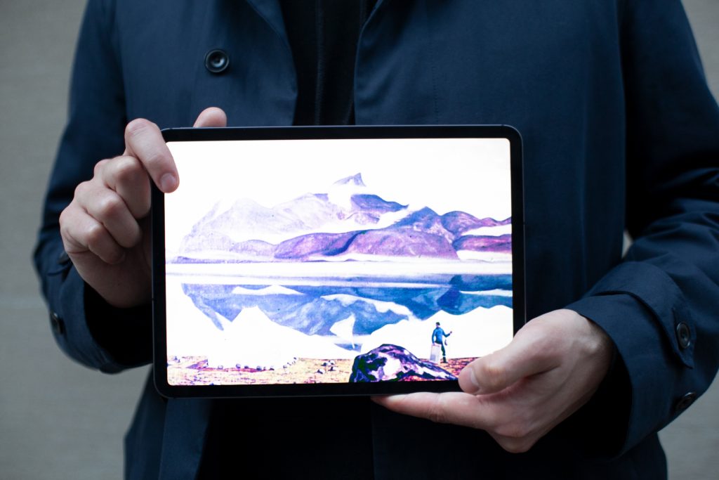
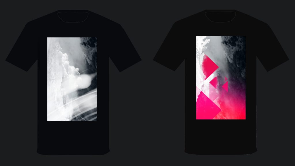
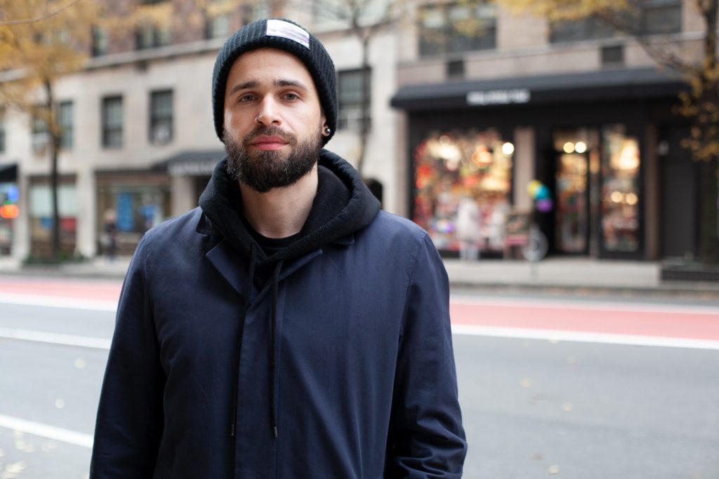
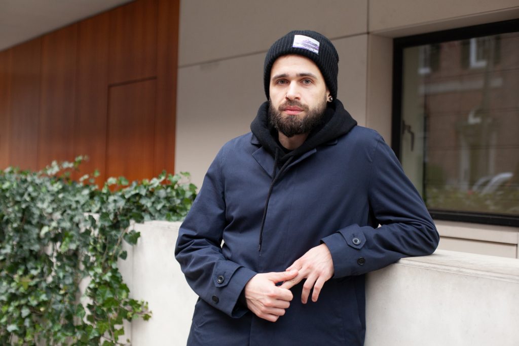
We just asked what they thought the painter was trying to say through his work, what was his purpose in creating that art. Our assumption was that Rockwell Kent’s works, simple and self-explanatory, would resonate best with the perception of people who have never dealt with art professionally. To an extent, that assumption was proved correct. We actually finished both shooting and the cut of that episode in the spring, and even had a preview screening of it but later decided to postpone the release to maybe get our new fashion collection prepared for it. Northiness is a multimedia project in which photos or videos are just a couple of the mediums we use to communicate. My part of the project is more graphic-oriented. I create the artworks that we use in our fashion design — as the prints on the clothes or as our supportive art. For instance, this time we are going to make beanie hats with removable sticky patches.
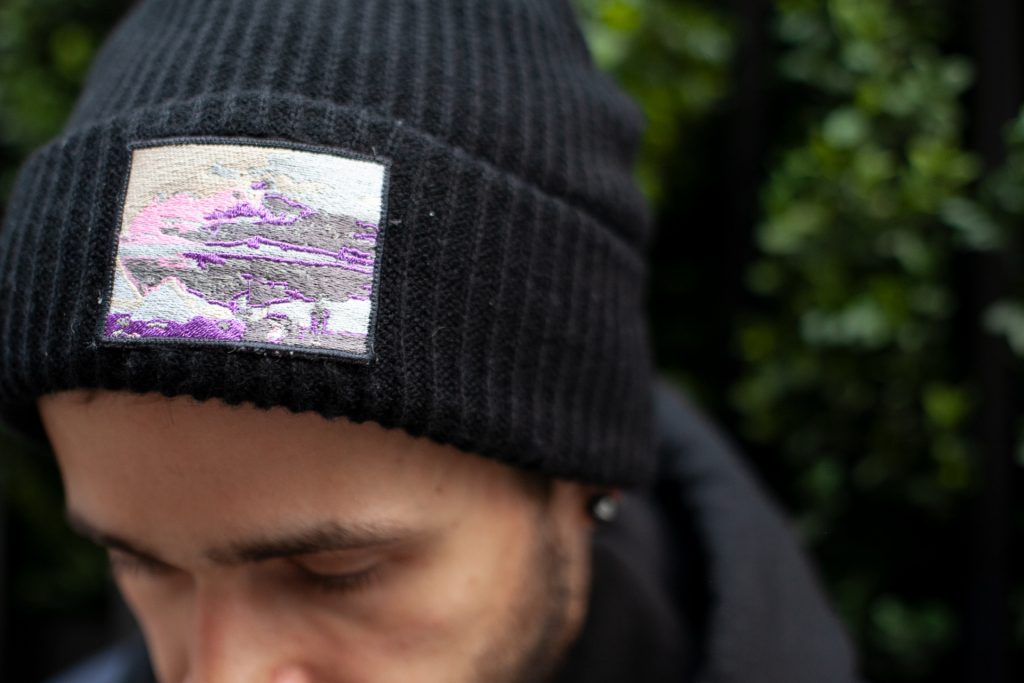
The patches will be sort of reproductions of famous paintings, and this is the first test item. But obviously my favorite part as a contributor to the project is writing music for it.
So, has there been some music this year as well?
Yep, but not for the Northiness project. This year I released the debut record of my music project, Gust Recorder, and I also had some fun as a designer in the release of it. The record was initially only released in digital format, so it didn’t require any graphic design for CD or vinyl packaging, but the album’s artwork is something precious to me. It actually has some story behind it. About four our five years ago, I was obsessed with the idea of creating concept art for an imaginary computer game. I had a pretty decent vision of the conception and started to sketch out some ideas of how the whole setting and some backgrounds might look. I never finished it, but when the recording of the album was nearly done, I realized that those two images I came up with some years ago were a perfect match for the album’s mood.
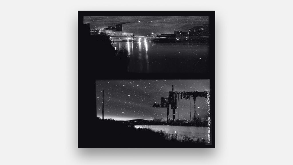
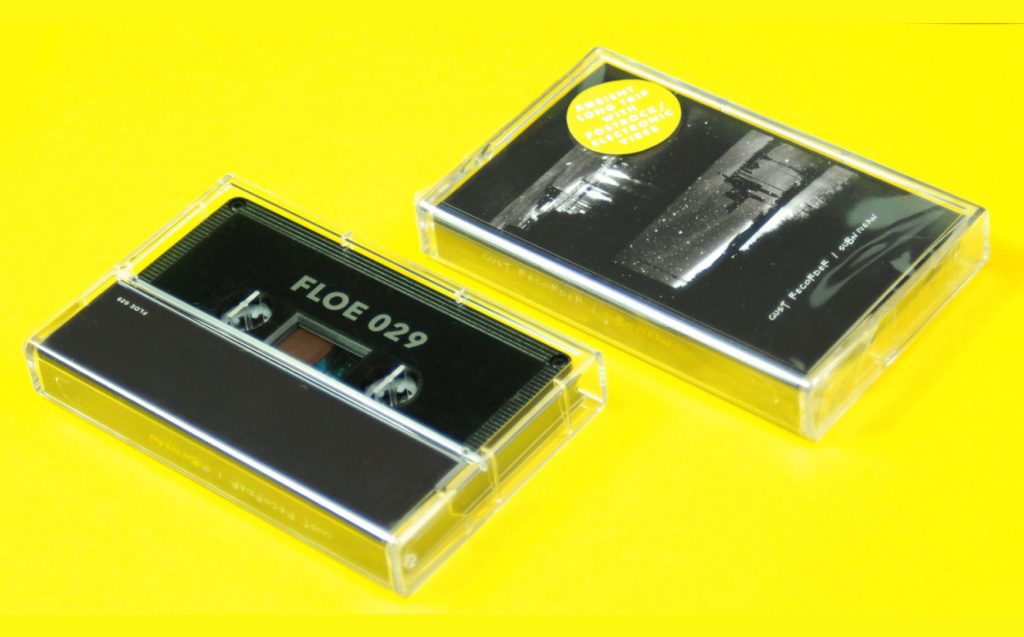
And using those images directed the whole visual communication of the release: besides the album art itself, I also came up with some short teaser videos, a website, social profiles and so on.
Looks like you’re giving your attention to a lot of things: a tech company, fashion, art, music. Is it just a coincidence or do you intentionally choose more cross-disciplinary projects?
Well, I think this is all more about inspiration. To fuel your creativity, you need to grab inspiration here and there. I’ve been working in design for ages and still frequently find myself referring to what inspired me when I started crafting images using my computer back in the early 2000s. That was a time when the Internet was more playful and people just started to get a feeling for how to deal with it in terms of business. That’s why there were more emotional and less rational elements in early digital designs. I recently started a blog on Tumblr, where I collect my personal archive of that early digital art that inflated the so-called world wide web back then.
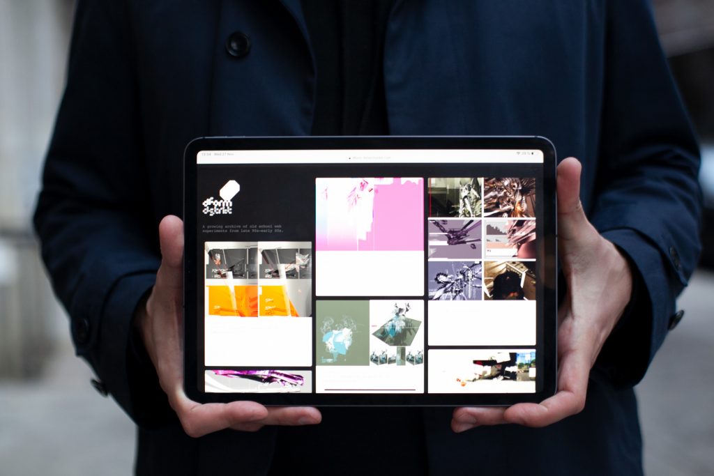
Music, art, fashion — those things shaped the form of design more than business rationale. I vividly remember being a teenager and surfing the Internet late at night when I first encountered designgraphik.com, and how the perfect combination of music, 3D art, and flash animation hit me. That was the moment that I fell in love with web design and realized I wanted to make the same — touching, emotional and often crazy projects. And that was the right time to start a professional career with that intent. It took me a few years to set the wheels in motion. I finished British Higher School for Art and Design in Moscow, worked in a couple of places, and then in 2011 ended up in Red Keds — a fabulous Moscow creative agency.
Why Red Keds?
At the time, it was like being invited to join a rock band. Red Keds had made its name making award-winning flash sites. You can check out the agency’s profile on the FWA awards website to get the idea of how trendy it was. I joined the agency as a designer and dove into the creative process right away, having the pleasure to work back-to-back with top guys from the industry. There were projects for big international brands, such as Honda, Panasonic, and Unilever.
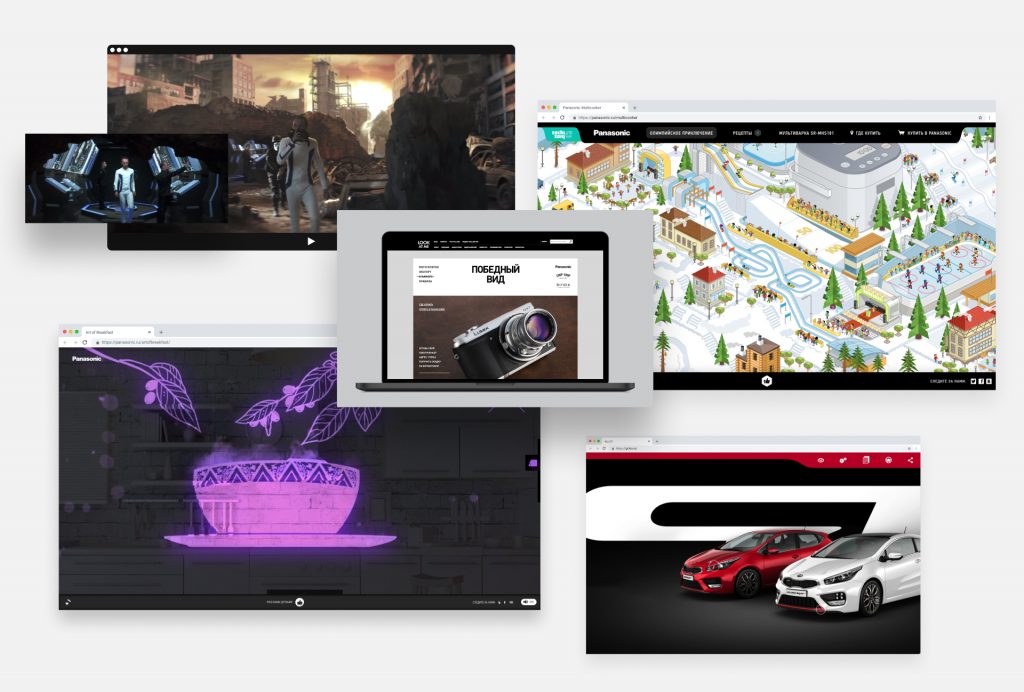
The advantage of working at Red Keds was not only the chance to work with the best coworkers for the best clients but also getting used to thinking bigger. When clients chose us over the competition, it was foremost because of our creatively fearless approach. We brought some really crazy ideas to life back then: making a fake fitness club to promote photo cameras, building a real post-apocalyptic landscape to shoot an ad, making a kitchen appliance website in the form of an Oriental fairytales narration — just to name a few.
That sounds good in terms of ideas but what about the design side of the projects?
Yes, that’s the problem. When you work in an advertising agency for a bunch of clients and have a constant flow of projects, execution often becomes an issue. Most of the projects you work on can be described as “promos.” They are synchronized with a particular advertising campaign and have a rather short lifecycle. On the one hand, that allows unconventional ideas to be accepted and executed. On the other hand, you often just don’t have enough time to polish things. And that’s the moment when a client comes up with a bunch of crucial comments and an agency producer tells you that we can’t spend any more design resources on this project. You start working long hours trying to reach the level of quality you can be satisfied with but never succeed, and end up releasing a mediocre project and burning out because of not achieving the level of perfection you’ve always been advocating.
And so, did you?
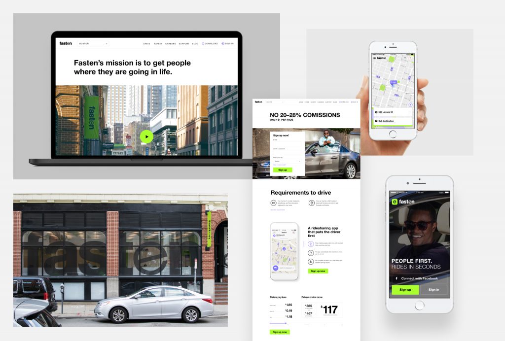
Totally. I spent over 4 years at Red Keds, starting in a designer position and ending up being a senior art director. I invested a lot of time and effort in the projects we did and at a certain point felt that it was the end, that I just couldn’t handle that pace and intensity any longer without sacrificing my mental health. By the way, I think that’s one of the problems guys from creative industries, especially advertising, encounter. We lose connection with the things we do, feel a lack of control over the outcome. I think that’s why more and more often, guys from agencies make a transition into product teams. That’s what I did. After taking a break for a few months, I joined Fasten — a transportation startup that operated in Boston and Austin and competed with Uber and Lyft for bringing a fairer model of ride-hailing to the market.
How was that experience different from what you had during your agency years?
It was different. I truly enjoyed taking care of just one product after years of dealing with several simultaneously. What is probably even more significant than a clear focus is the ability to understand and impact the company’s business. That’s a cliche but a cliche worth mentioning — designing for a digital product is more about designing the service itself rather than its execution in the form of a graphic interface. Discussing new ideas, prototyping them and testing right away in real life — it’s a very entertaining and inspiring approach. For example, one of our core values was to provide more humane treatment for the drivers. One of the features we came up with and implemented quickly was an easy UI for riders to tip drivers and drop them a compliment. And we immediately started observing how it affected the whole process: users were happy to tip and drivers were happy to be rewarded. Working in Fasten was a great adventure. And, obviously, not an easy one. Competing with Uber and Lyft, which are backed by huge amounts of investments, was a hell of a ride. We eventually had to leave the market but we were proud to not have sacrificed our values of equality and a “people first” approach.
Is your experience at Smartcat similar to what you had in Fasten? I mean, it’s a growing industry, promising digital product, and competitive market…
Yes, to an extent it is. Just like Fasten for the ride-hailing industry, Smartcat offers new approaches for the translation industry. I believe the difference is that this area is not as overheated by speculative investments as transportation. You can gain new clients not by unreasonable discounts and money injections but by improving your product.
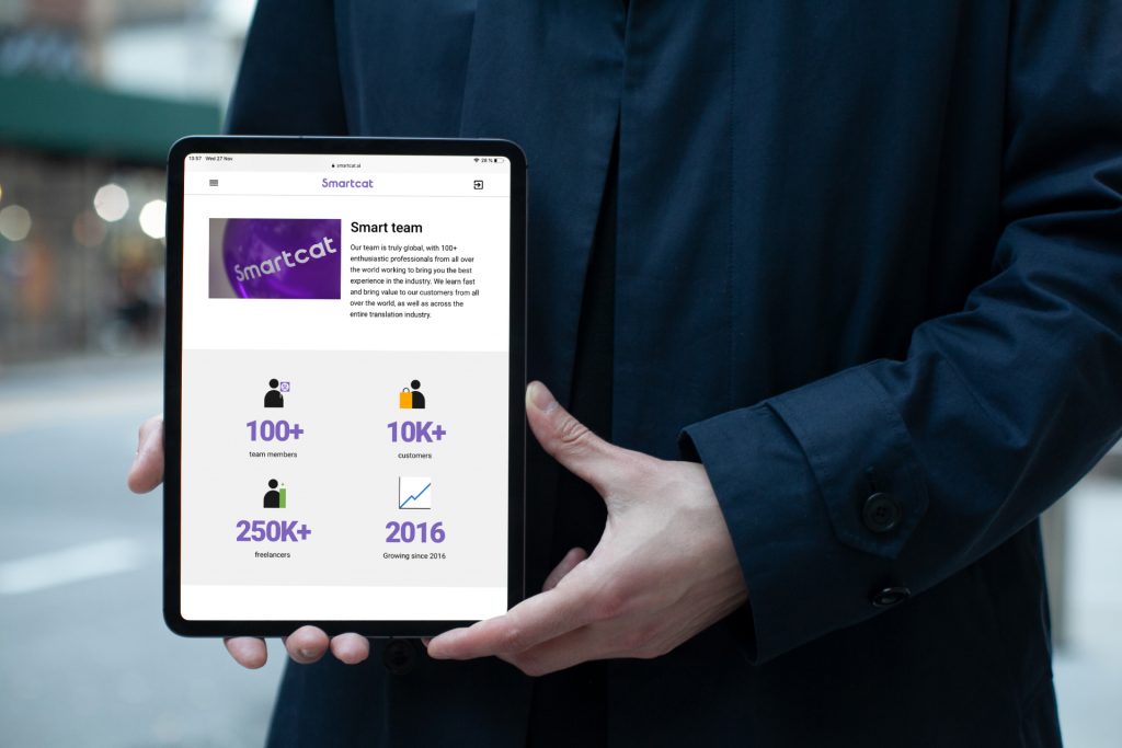
My job is not only to communicate the constant adjustments we do but first and foremost, about the values we believe in. It’s what we call Connected Translation — the collaborative and connected approach to making and translating content. It’s pretty similar to what we have regarding design instruments. Smartact offers collaborative translation just like Figma offers collaborative design. Smartcat offers integration with website CMSs just like our design tools are connected with prototyping tools, etc. I am personally enamored by the easy and beautiful solutions we have now to eliminate manual version control and messy content integration. It looks like we are living in the golden age of tools that are finally in sync with the very nature of the things we do.
What are your favorites?
Oh, I’m a huge Figma advocate. I honestly think it’s the best thing that has happened to digital design tools since the emergence of digital design tools. I think that it beautifully conveys the idea of design as a job: making things simple and useful in the most beautiful way. Figma declutters the design process and reduces the number of unnecessary artifacts dramatically. Besides that, I tell everyone that Notion is awesome for notes and wikis, Principle is awesome for prototyping and Webflow is a great site builder. Plus, if you are a productivity geek you should be using any Pomodoro timer. Pomodoro is a tremendous technique that helps tackle really big, intimidating tasks.
Give us some other workflow and productivity hacks.
The first thing that comes to my mind is obviously the “Eat the dead frog first” rule. Doing something daunting in the very beginning of the day not only makes it done the right and most effective way but also makes you feel better and relaxed for the rest of the day. Having one particular task for a day clearly highlighted and written down is also a good habit. Especially when you set your priorities for the upcoming day in the evening. Being able to get down to business in the morning right away, without spending time on routine task management is a great productivity boost. Last but not least, go out and breathe the fresh air. Oxygen is crucial. I’d even recommend being less obsessed with productivity as a way of being more productive. There’s a point when the urge to achieve more becomes counterproductive and doing more doesn’t mean accomplishing more. You continue to produce a lot but the quality and usefulness of what you produce decreases significantly, and that doesn’t lead to greater results. In the end, we do our design work to live a better life and our emotional wellbeing shouldn’t be sacrificed. That’s probably the main idea that supports and leads my career as a designer. I want to do honest things, not lie to myself and others. I want to be sure that people need what I do and what I do at least doesn’t make the world worse.
Do you think design can make the world a better place?
I think we hear that motto too often and too few of us as designers really contribute to this idea. We should say less and do more to prove that we can change something.
Ilya Sizov is a multidisciplinary designer and art director from Moscow, Russia.
