Published by Leonardo Calcagno
Interview with creative director, Miruna Sorescu
Who are you and what is your background?
We are a team of three, with a background in design and communications.
In what city?
The magazine, as well as two of us, are based in Copenhagen, Denmark, and one of us has recently relocated to Vilnius, Lithuania.
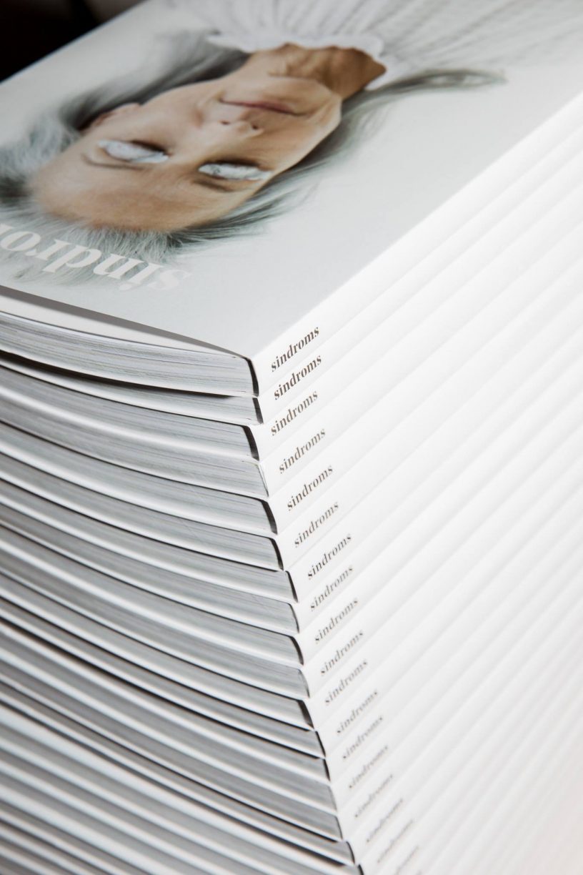
Sindroms ….
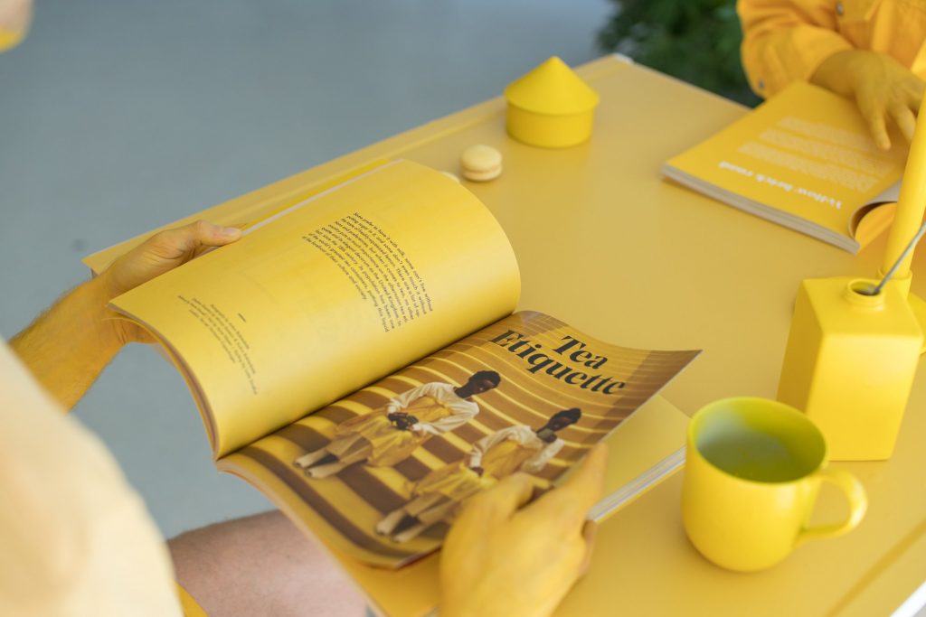
The idea for the magazine came out of a personal need; we were all expats coming from quite colorful cultures, living in Scandinavia – so we were just missing color in our daily lives here – that’s how the idea sparked. We loved the independent print and wanted to start such a project because of its multidisciplinary focus – we could work with a lot of different things we were interested in: design, editorial, telling stories, collaborating with wonderful people, etc. And we loved working with color, and were fascinated by how color can be used to influence someone’s moods and emotions – so we decided to explore that by creating this magazine that immersed people into a single color with each of its issues.
Editorial …
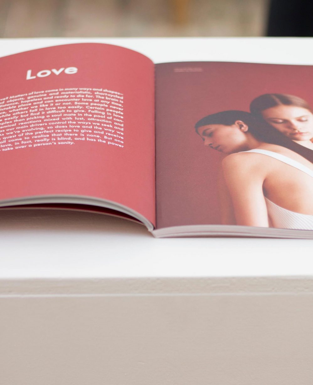
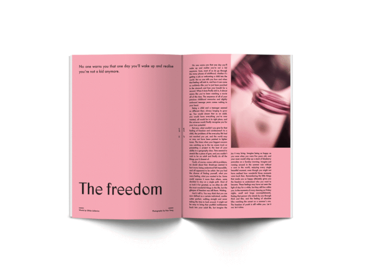
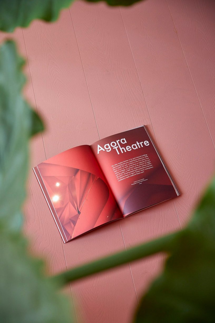
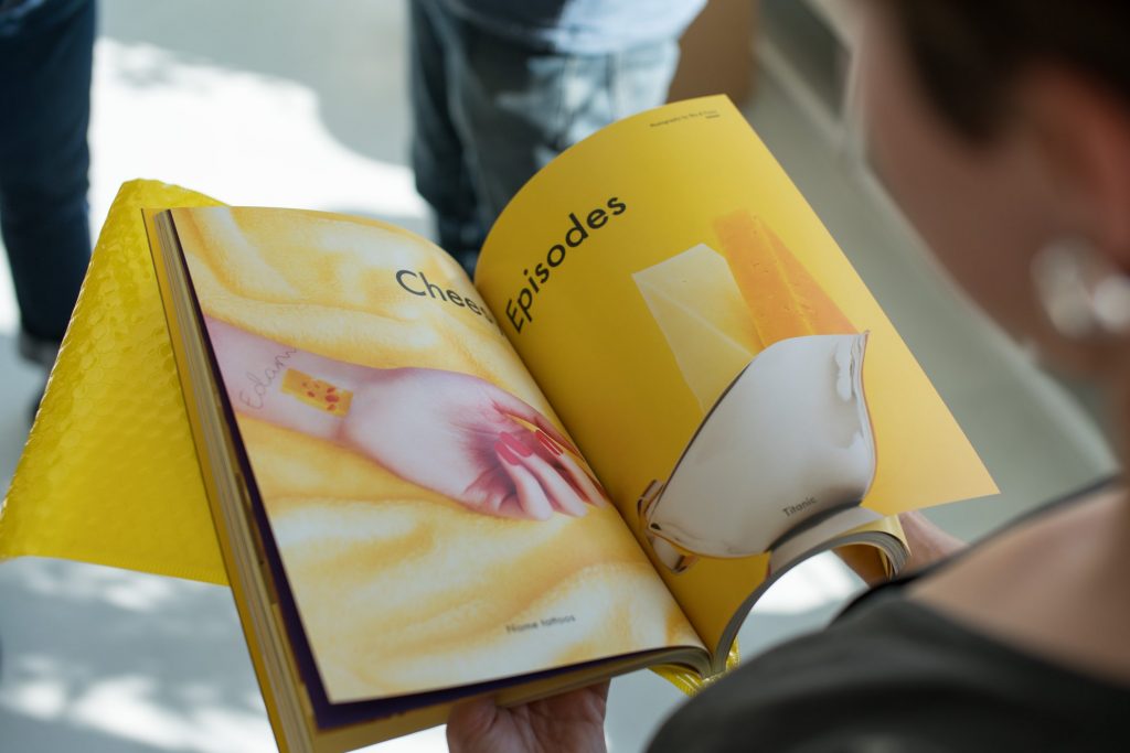
The color of the issue always inspires the editorial direction. That means, we start by brainstorming what associations we have with the color, and then agree on a few feelings, emotions, or states of minds that we feel represent the color best (for example, happiness, optimism, and anxiety for yellow) and then that’s what inspires the content and stories. We don’t have any set content categories, and it can depend on quite a lot from issue to issue since the color will dictate what we end up exploring. What’s most important to us is to do justice to each color, and be open to going in whatever direction it steers us.
Print: Why choose print? What kind of paper you use and why? Typography?
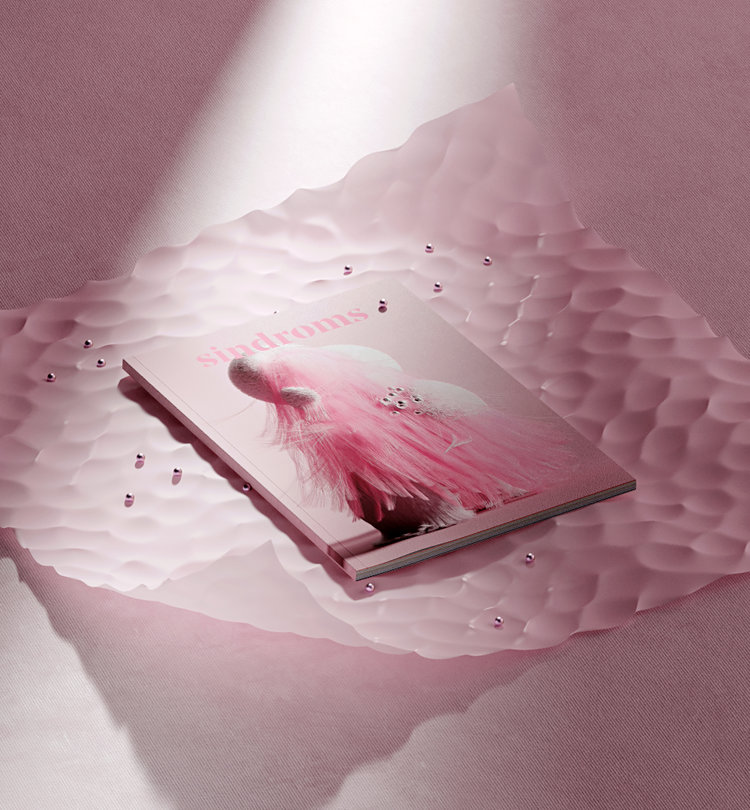
We wanted people to feel each color, to take a moment to sit and explore and be inspired – and this is something that print can evoke in people, unlike the digital media that we mass-consume without even realizing. We always use a combination of different uncoated and coated paper qualities, and this can also depend on the color. Some colors get absorbed more on different types of paper, and it’s important for us to have the colors come out as accurately as possible, so we do a lot of testing.
How’s the public response?
We have a nice community of faithful readers, and it’s always nice to see people that bought our first issue continuing to buy it every time. The response has been very positive, also in Scandinavia – where we maybe had our doubts in the beginning. Our main readership consists of creative individuals – whether it’s designers, stylists, architects, writers, etc.
Can you give us a tour of your local media scene?
There are quite a few other independent publications based in Copenhagen, and Denmark generally, so it’s nice to have someone to exchange impressions and advice with. It’s of course also a hub for design and fashion magazines. (not indie)
Business: Indie mags get a lot of love, but it doesn’t always translate to sales or advertising. How’re the sales? Advertising-wise, is it a normal approach to selling an ad page or more a brand ad approach?
The sales are good, and they allow us to continue making new issues and increase our print run a bit with each new issue. (4 so far) Printing is a huge expense though, so most of our budget goes to that. We in the team create the magazine in our free time, alongside our day jobs, and all of our wonderful contributors contribute on a voluntary basis – which we are extremely grateful for. We don’t have a lot of ads – we never wanted to include more than a handful in each issue, in order to not disrupt the experience for our readers and also to really make the brands we do want to promote shine. For us, the ads and the products promoted in the ads also have to be the same color as the issue (for the same reasons above), and have to fit with the aesthetics of each issue, so we can’t really go for the bigger, more mainstream brands that do have the budget to pay. We mostly like to use the ads to promote smaller artists and bands that we admire, and we think our readers should discover.
What is your online strategy?
We don’t really have the time for a proper online strategy. We use Instagram as the main channel to promote the magazine and reach current and potential readers, and then also Facebook.
What inspires you and motivates you to go to work every day?
Doing something we truly love and enjoy.
What were your biggest challenges as an entrepreneur?
Running a business and securing the budget needed to keep it going.
What advice would you give someone who wants to start a magazine?
Make sure you’re doing something original and unique, that no other magazine is doing.
Upcoming projects
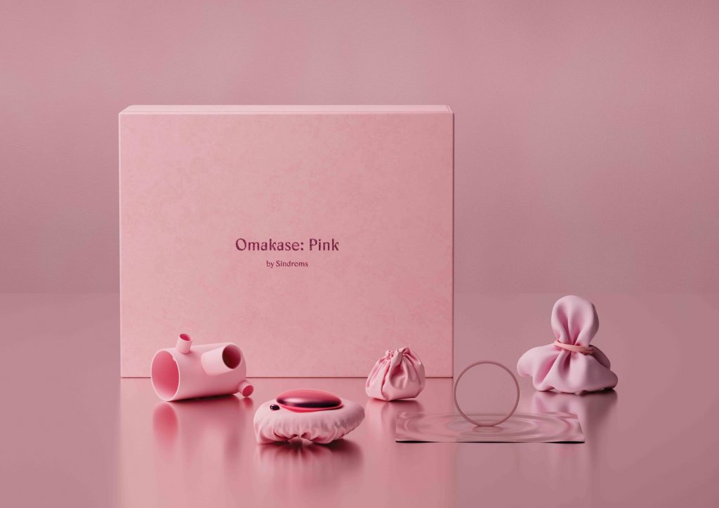
We are now busy finishing our 4th issue, pink, which is due to be released in September. Alongside the issue, we will also launch a new project we’ve been working on for some time, following the same monochrome pink theme. We can’t say much more about it now, but stay tuned – we’ll reveal everything in a couple of months 🙂