According to the latest psychological research, the environment is very important for a person’s development. And after birth, the earliest environment for any person is a nursery. This why its design is so crucial. You want your kid to grow in a healthy atmosphere – you start with a proper layout of the room. These 7 rules are imperative for the design of a kid’s room to be relevant today and remain modern and adequate for many years.
- Neutral finish
This is the most important point, which, firstly, will save money, and secondly, it will make the interior of the children’s room pleasant for both children and adults.
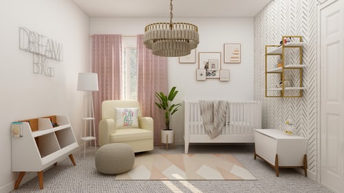
All overhaul of the children’s room: the ceiling, floor, walls, all electrical details and lighting are done in a neutral style – this is the background.
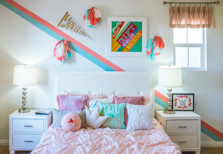
The decor makes the design of the children’s room striking – bed linen, pillows, curtains, stickers, posters and drawings, toys, a carpet.
In regards to the visual perception of the design by people in general and children in particular, there is no difference in which tools and methods will be used to add brightness to the interior.
By simply changing the design without installing new items, it will be possible to adjust the design of the children’s room on a budget to fit age and interests.
How to check yourself:
Imagine a room with all the finished design, but without furniture – it should not be clear that this is a nursery. The exception is wallpaper, which can be changed quickly and inexpensively.

Most parents would like to create the design of the children’s room for a long period of time, but it is important to take into account that the child can try to “improve” it with pencils, felt-tip pens or literally anything else. It is better to provide a special place for drawing: a slate or marker board, an easel. And the interior will be saved while having a creative outlet.
The most practical materials:
– for the floor – laminate,
– for the walls – decorative plaster or stone (indestructible) or paint (easy to ruin, but when the wall is painted it costs a few pennies to repaint),
– for the ceiling – matte stretch or drywall.
2. White furniture
The furniture will have to be changed, but here too there are good news and a strict rule.
Rule:
The younger they are, the more kids like everything bright. And rich colors don’t match with the wood and wood tones. It is because of this that the design of a children’s room often turns out to be ridiculous. If there are bright colors, then use only white furniture.
Most designer renovations for children come with white furniture. Many designers do this unconsciously – they just feel the combinations. If you are looking for inspiration try nyfurnitureoutlets.com.
A pleasant moment: it is not at all necessary to buy deliberately children’s miniature wardrobes, tables and cabinets. This is a waste of money. For the younger one, floor open shelves-sections and baskets for toys are enough. You still will not achieve order at this age – there is no point in making closed storage places.
In the nursery for a primary school student, you will already have to buy full-fledged furniture and subsequently change it to adult for high school, but this is only one full-fledged change of scenery.
3. The combination of colors in the nursery
Colors should be matched in brightness and saturation. Therefore, we choose unsaturated pastel colors and then you can combine and mix any colors and it will look harmonious.
And do not make children’s rooms in acid, torn-eyed tones – if you yourself would not like to live in such interior, then the child should not either. At the moment, they may like the colorful interior, but the kid will be in the room for a long time and aggressive colors will have a negative impact.

Modern colors for the nursery: dirty blue, pistachio, pale yellow, turquoise, pale pink, grassy green are a bunch of cool pastel colors suitable for a kid’s room.
4. Choice of style
Considering everything that has already been disassembled, the design style for the children’s room is already more or less clear.
Basic finishes – minimalism or Scandinavian style are suitable for both sexes, Provence – in a girl’s room, loft – in a boy’s nursery. These are serious adult modern styles, into which the initial design can transform over time, but they are perfect for a kid due to the brightness of the design. If you decide to keep within the framework of one of the styles, then the white color will no longer be so critical.
For example, a Scandinavian-style children’s room design involves only pastel accent colors, and they go well with light wood in furniture. In a loft, the layout can be dark, and at the same time, the interior of the nursery will be balanced with warm colors (orange, yellow, brick, etc.).
5. Zoning
There are 2 types of children’s room zoning: horizontal and vertical. The second is more interesting and extreme, but first things first.
Horizontal
The layout of the nursery usually has to be done in a very small area. Therefore, capital non-functional partitions are not our option. If you divide space, then only via wardrobes. The ideal partition is a wardrobe or a rack.
Usually, the task is to separate the play area and the workplace as far as possible. To do this, there must be an area for sleeping and resting between them. The child is more likely to be distracted by play than sleep. Therefore, placing a bed near a desk is relatively safe.
Vertical
A more interesting and difficult option is the zoning of the children’s room in vertical. Moving different zones to different heights involves volume, not just area. The main thing is that children really like vertical zoning, it gives them a sense of security and their own corner.
Children sometimes want to have only their own cozy place. Hence the love for huts, blanket castles and fortresses under tables. The ability to climb and settle a little higher is similar.
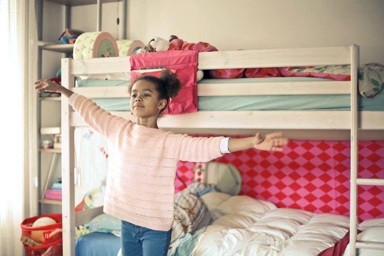
A bunk bed and a loft bed are the best zoning solutions in a children’s room. It is impossible to think of anything more practical, aesthetic and rational. If made to order, then the appearance will be at its best.
The first level can have a wardrobe, table, sofa, play area or one more bed. It is possible to make drawers in the steps. Here is an example of a stylish bunk bed:

6.Lighting
Electrical planning and lighting are super important. A children’s room is a bedroom, a living room, an office, and a playroom – it has a bunch of functions.
Lighting is both a design element in a children’s room and a clever way of zoning. Install a separate light source for the area near the table (plus a table lamp) and for the area with toys. On a not particularly bright day, the playing area will already be less lit than the table area and will attract a little less attention. In the evening, it should be possible to highlight only part of the children’s room.
7. Security
There are 2 options for how furniture can harm:
Release of harmful substances
Trauma
MDF and chipboard are two common materials for wooden furniture. Neither material can be called environmentally friendly. Both chipboard and MDF have an adhesive base and emit formaldehyde and other harmful substances. This is especially dangerous for children and may lead to the development of chronic diseases.
It is important that the chipboard and MDF are completely laminated, and the ends are covered. In cheap models, edges are often not made where it is not visible, for example, in the back. This is absolutely unacceptable – the edge should be everywhere to prevent the release of toxic substances and fumes in furniture.
