Published by Press release
At AB InBev, we’re reimagining what a beer company can be.
Last month, we announced the launch of our new global purpose— “We dream big to create a future with more cheers”—as well as the consumer-first strategy that will move us from being a category leader to leading category growth.
Today, we’re building on these announcements with the unveiling of our new visual brand identity, which connects with our new purpose and our evolved strategy.
Our new visual expression better represents who we are, what we stand for, and where we want to go. Its look is equal parts inspiration and aspiration–it respects our heritage while looking forward. “This simple and modern design better connects with the spirit of optimism, ambition and celebration that comes with our new purpose of dreaming big to create a future with more cheers,” says Richard Oppy, Global Vice President, Global Brands at AB InBev. .”
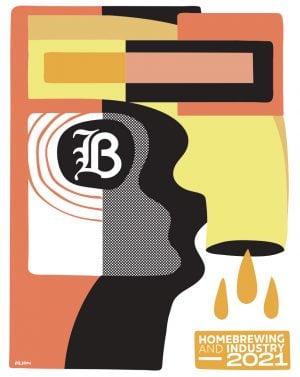
Homebrewing & Industry 2021: 52 craft beer recipes for homebrewers
Some key elements of the new design include:
- A symbol representing the clinking of glasses at the moment of “cheers,” connecting directly to our new purpose.
- A new gold color that captures our optimistic outlook and mirrors the golden hue of beer and barley, the cornerstones of AB InBev’s business.
- A new refined wordmark that modernizes our expression and connotes our forward momentum as a company and a business.
The new visual brand identity was designed by global consultancy Prophet. “As AB InBev moves beyond beer and beyond mainstream, we wanted to create a corporate brand identity that can play a larger role in the experience, communications landscape and brand expression,” said Prophet Chief Creative Officer Peter Dixon. “We believe this new visual and verbal expression perfectly captures AB InBev’s revitalized corporate brand and inspiring new global purpose.”