Published by Nelson Roberge


Having just graduated from Northumbria University in Newcastle upon Tyne in the UK, Emily Myers is fascinated by branding and packaging designs. Back in London to try and find a job agency, the young designer met with Baron to talk about one of his educational plans. The project in question was rebranding the packaging design of an existing product. Emily chose Young’s Seafood Products, a large British company dealing in frozen fish.
Baron : Who is Young’s Seafood? and why did you choose their product?
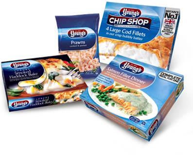
Emily Myers: Young’s Seafood supplies about 40% of all fish consumed in the UK each year making it an important undertaking. But despite this influence, their current branding does not reflect their legacy and longevity. People do not associate with this brand and neither does it stand out from its competitors. The motto of Young’s Seafood is “Everyone in Britain must love fish as much as us”, which shows a genuine passion and enthusiasm for the product. But this enthusiasm is not reflected by the current package design.
B. : How did you rework their image ?
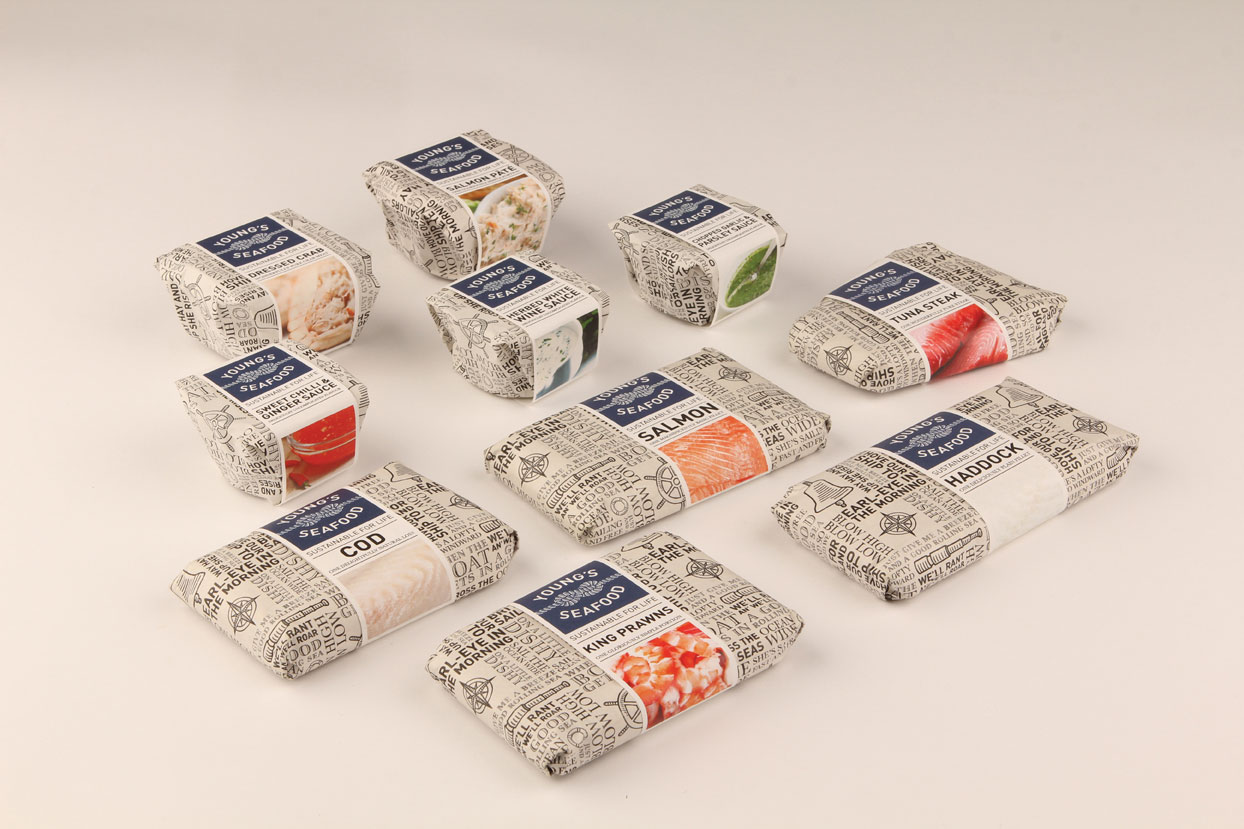
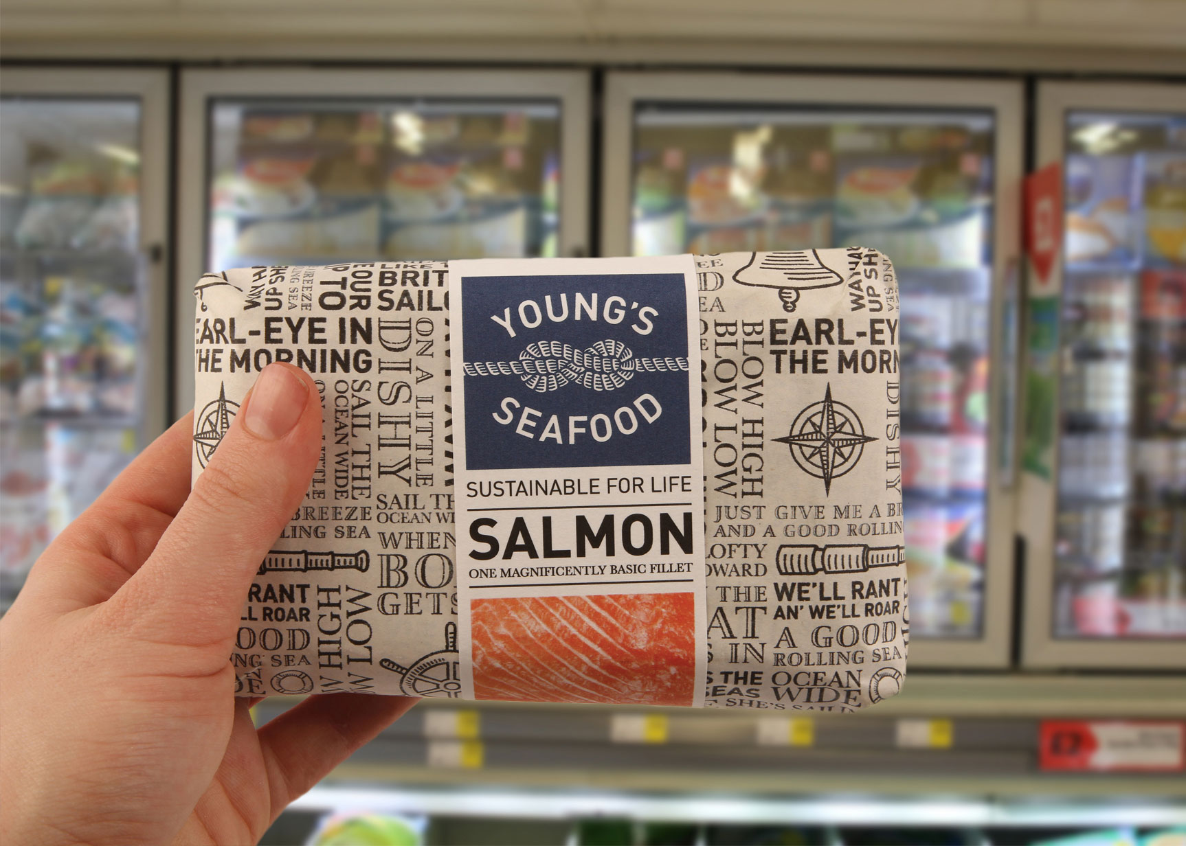
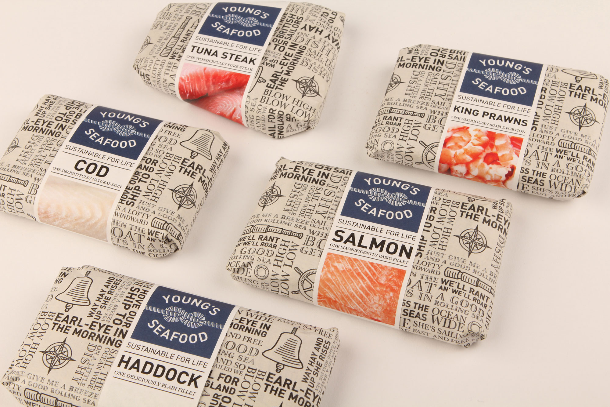
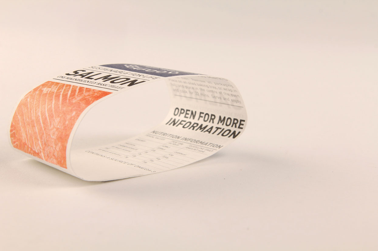
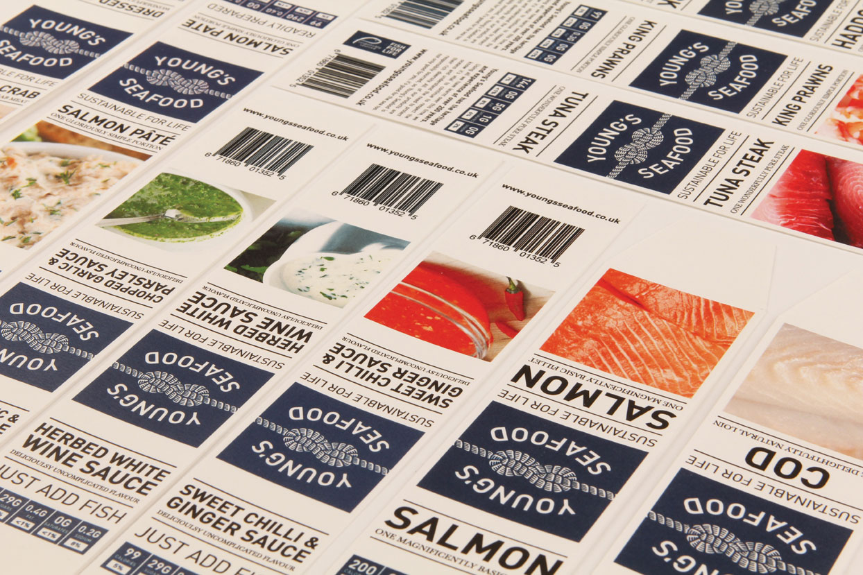
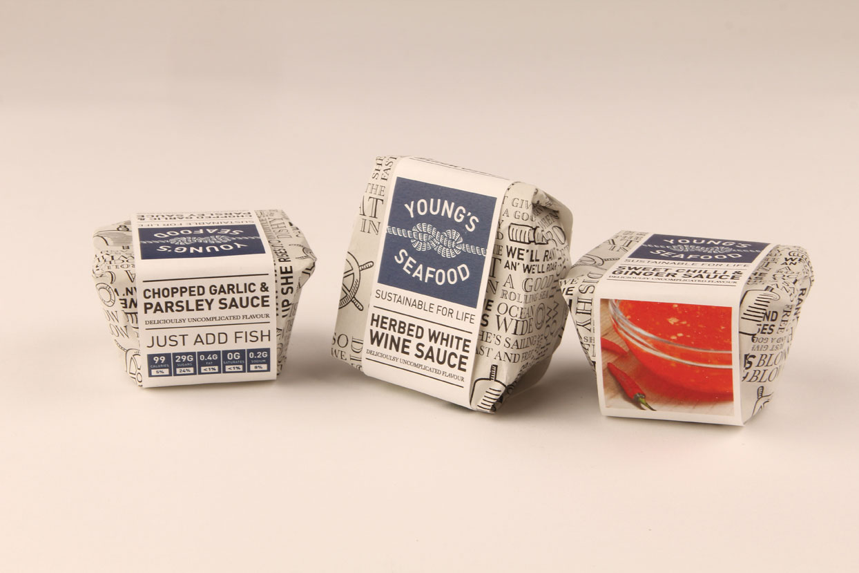
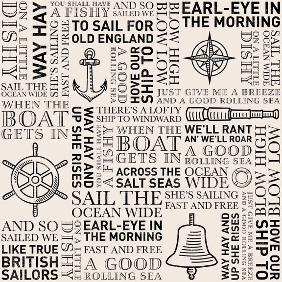
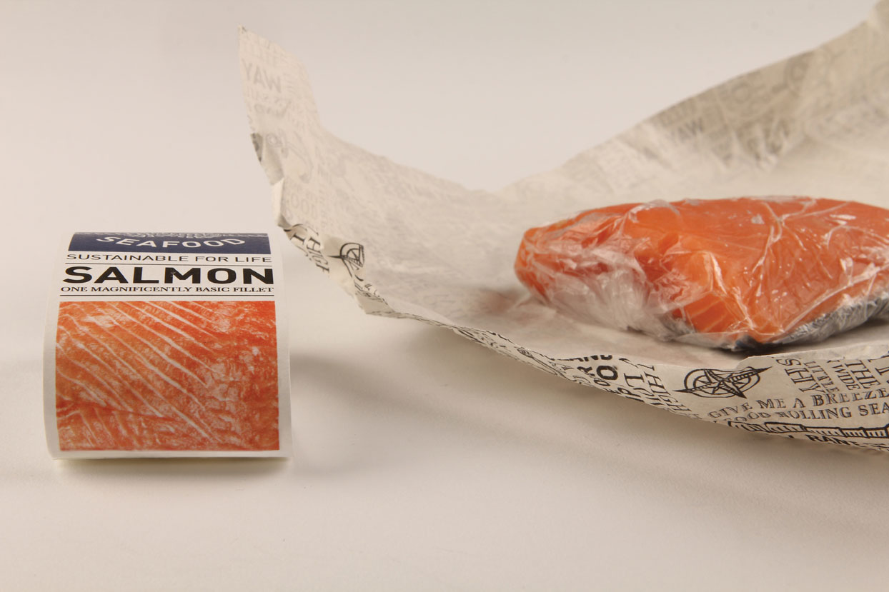
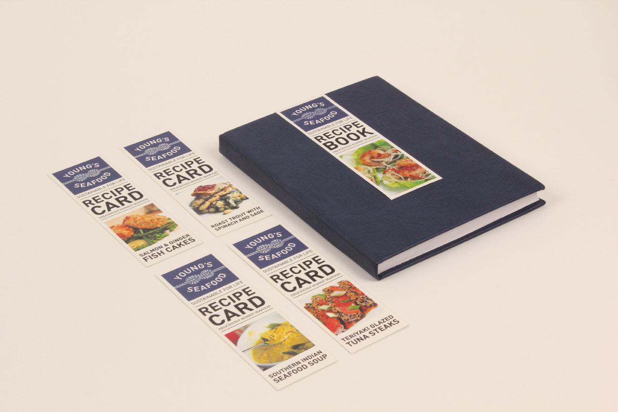
E. M. : With over 200 years of experience and longevity, Young’s Seafood understands the importance of sustainability in their business. The logo that I chose is a figure 8 knot, a knot commonly used in ships to tie a piece of rope securely to an end. It is a symbol that suggests protection, strength and durability. The mosaic pattern with words of sea shanties and work songs reflects the heritage and the considerable age of Young’s Seafood.
B. : What is the one question a company should ask before designing its packaging or rebuilding its brand image ?
E. M. : For me , when a company is considering revamping its brand and packaging , it is important to think about what makes them unique and to discover and establish their history and heritage.

B. : How is branding and packaging doing In Britain ? Are there a lot of new ideas or concepts? Can you name some products that stand out?
E. M.: Drench is a product that is out of the ordinary. It is a brand of bottled water and the packaging design is carried out by Jones Knowles Ritchie. Their approach challenges traditional conventions surrounding bottled water focusing more on the water itself rather than its source. Another example that manages to impress is the redesign of the brand Plymouth Gin by Design Bridge. The design has returned the Plymouth Gin premium brand of Pernod Ricard to its roots.
cargocollective.com/emilyjanemyers